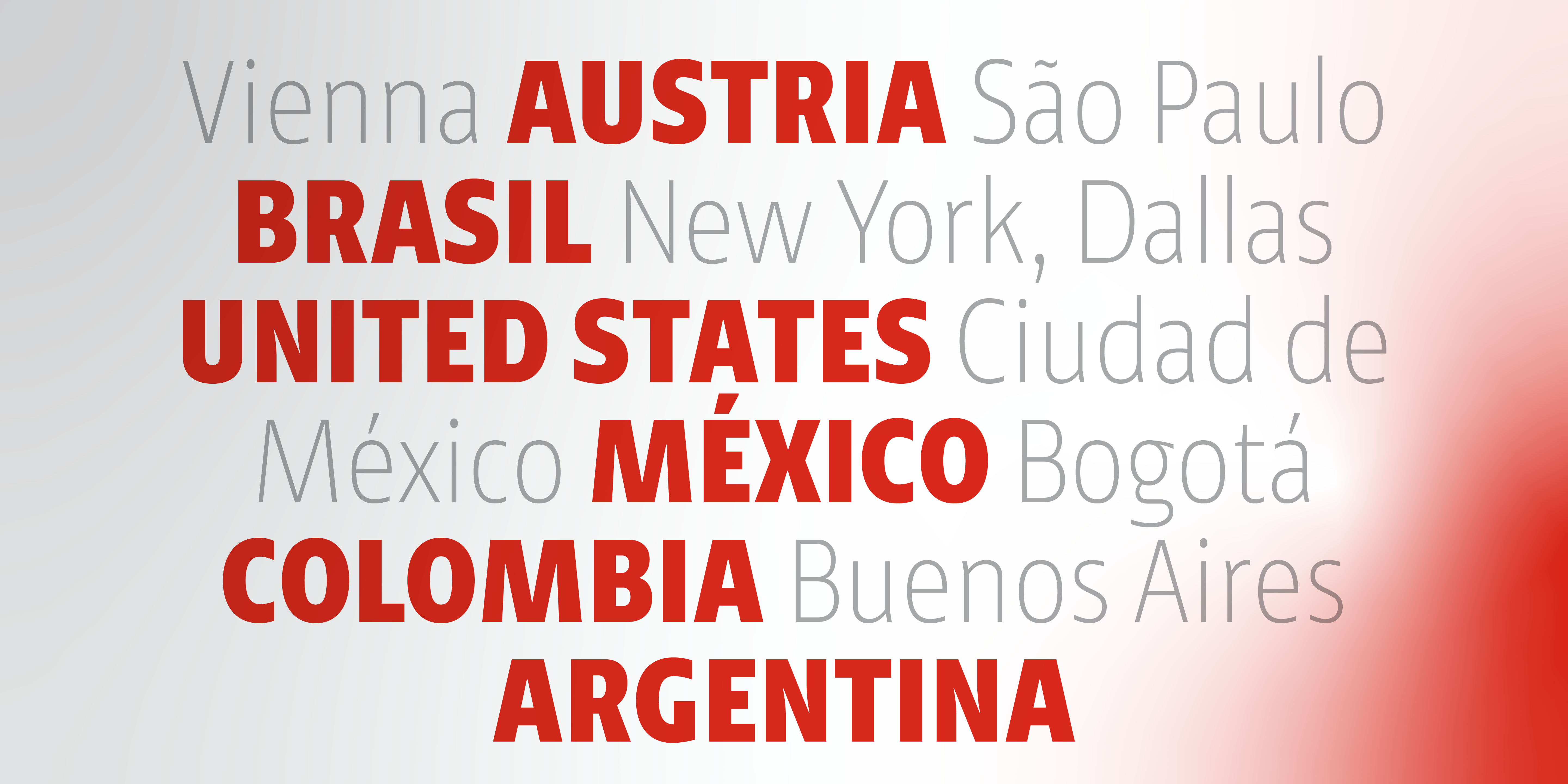
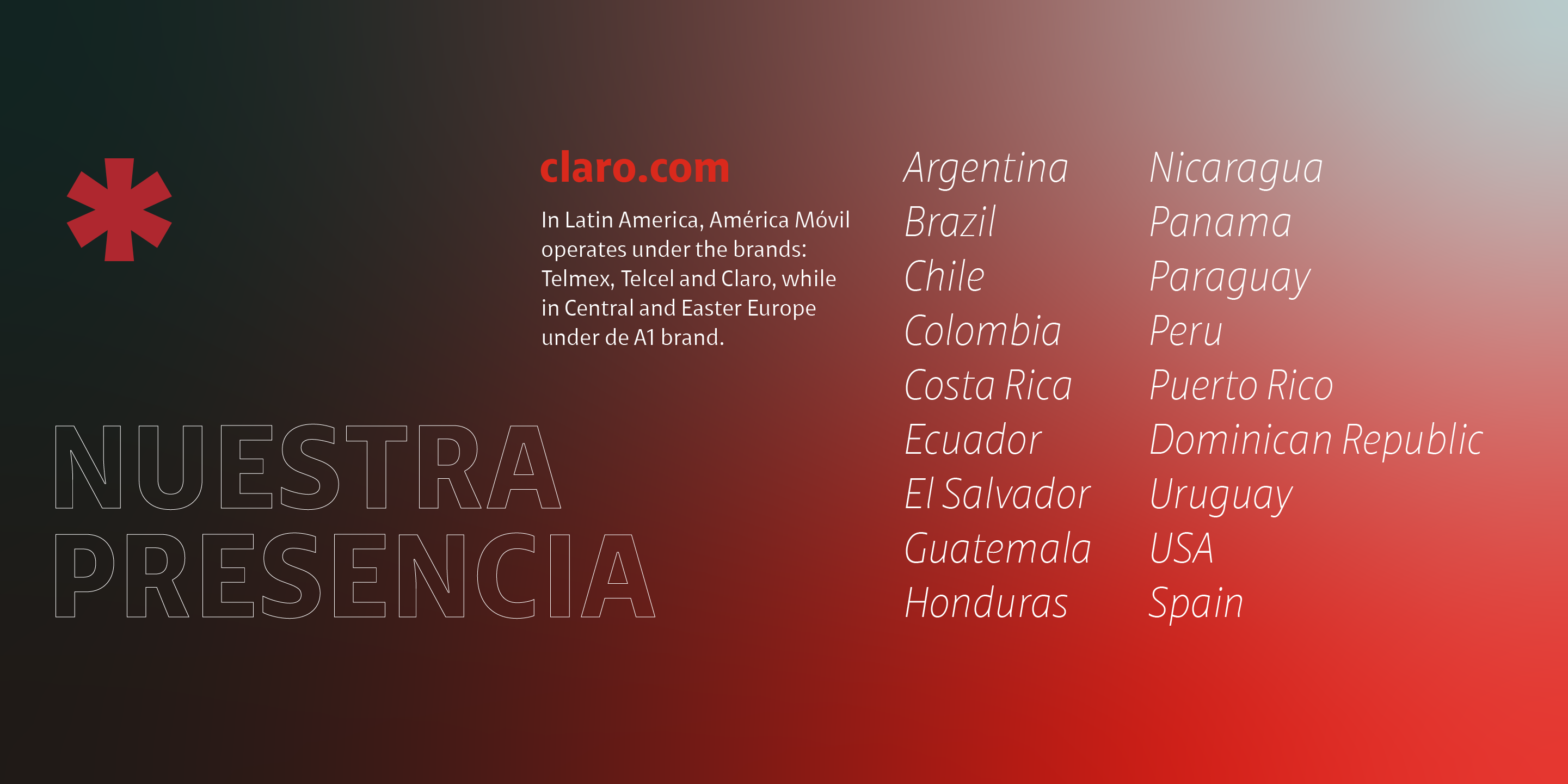
The Santa Marca agency approached us to develop a type system for the Claro brand of its client, América Móvil, a leading telecommunications company with operations in 18 countries in the Americas and seven in Europe.
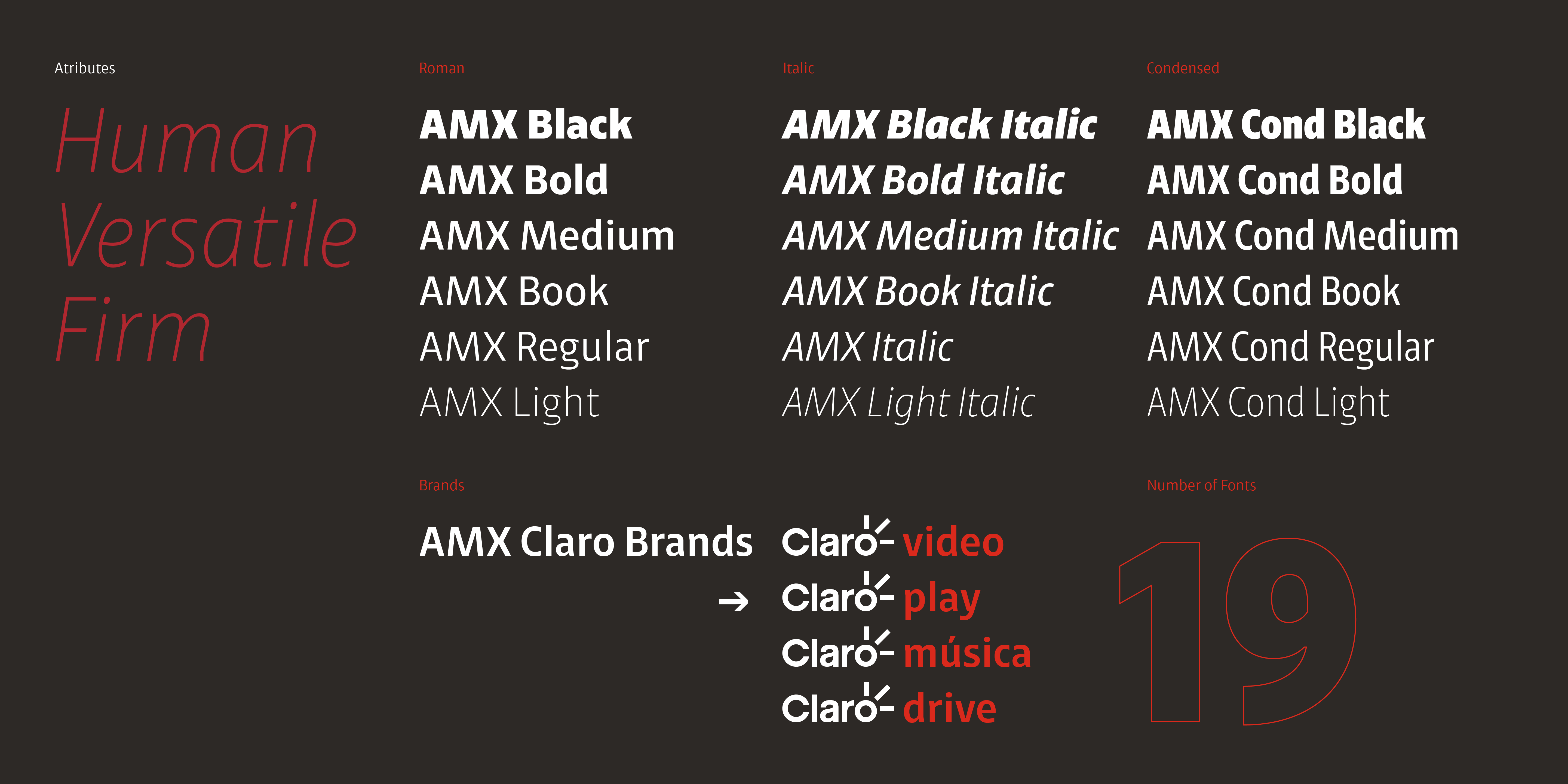
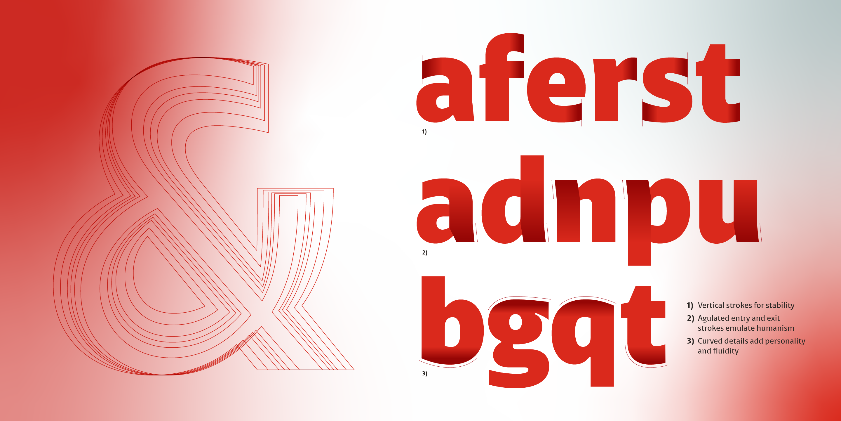
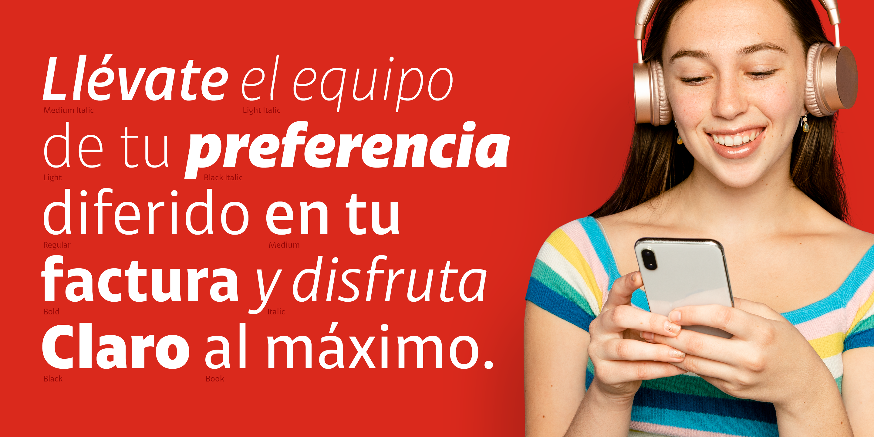
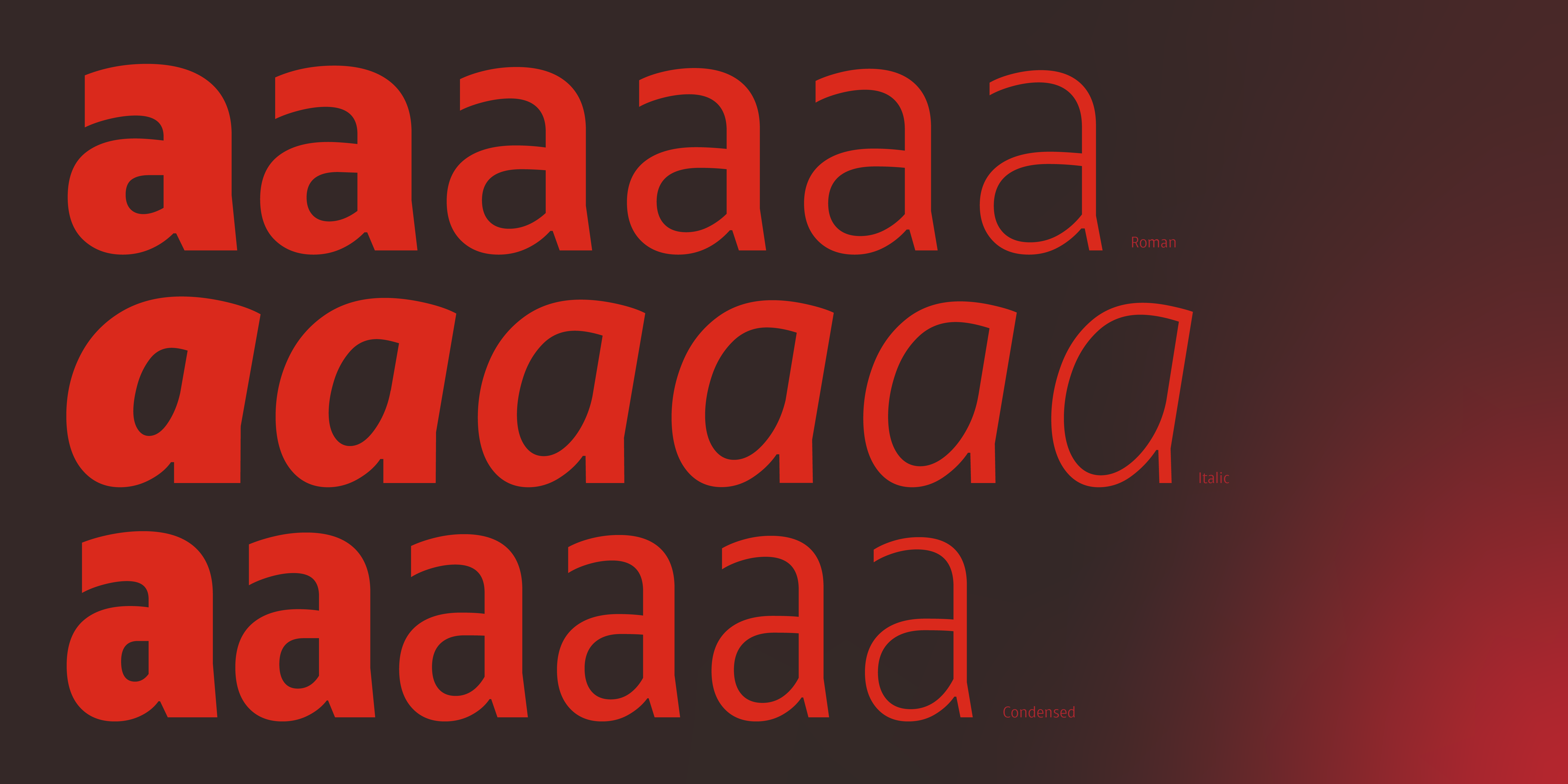
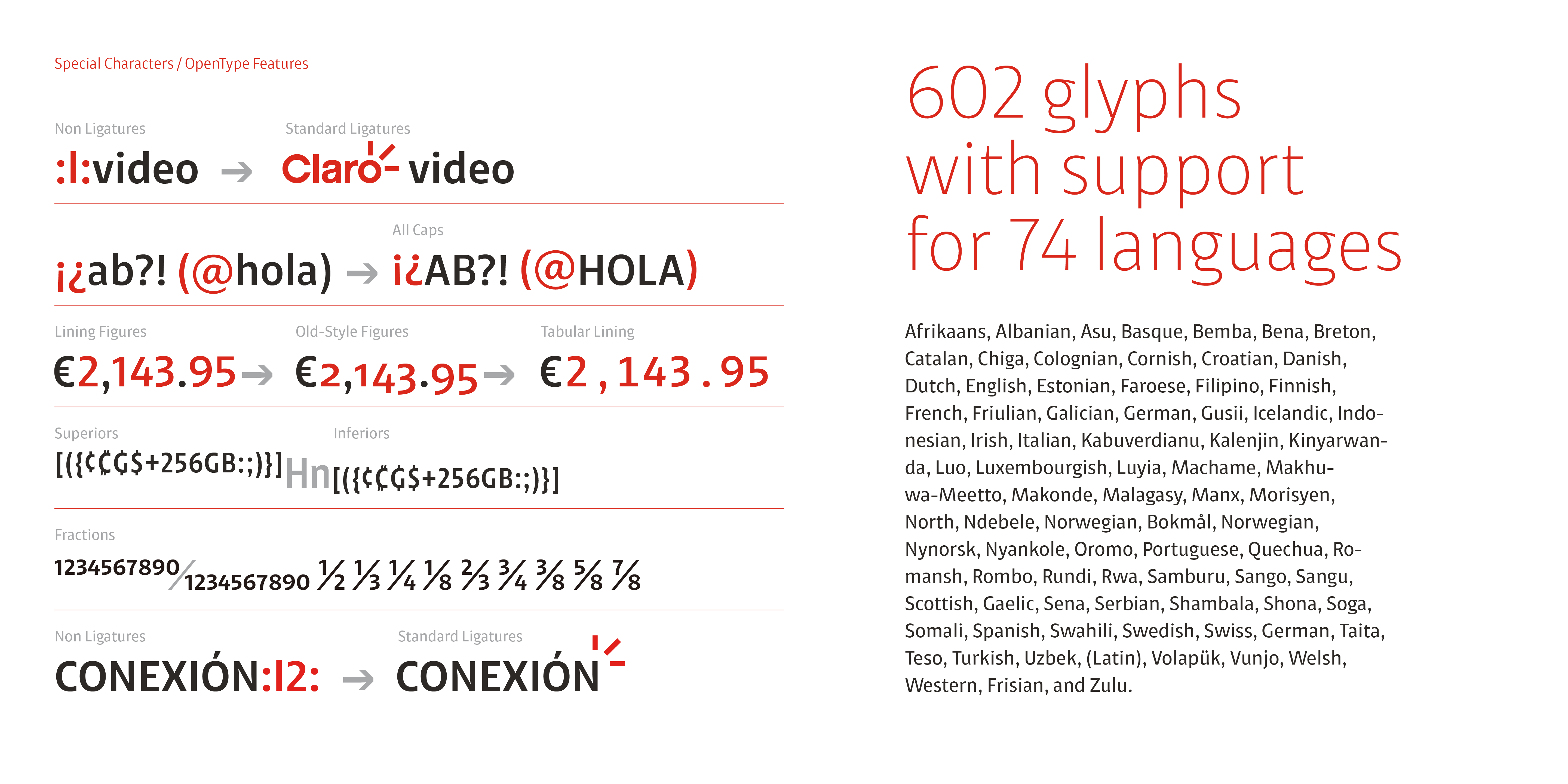
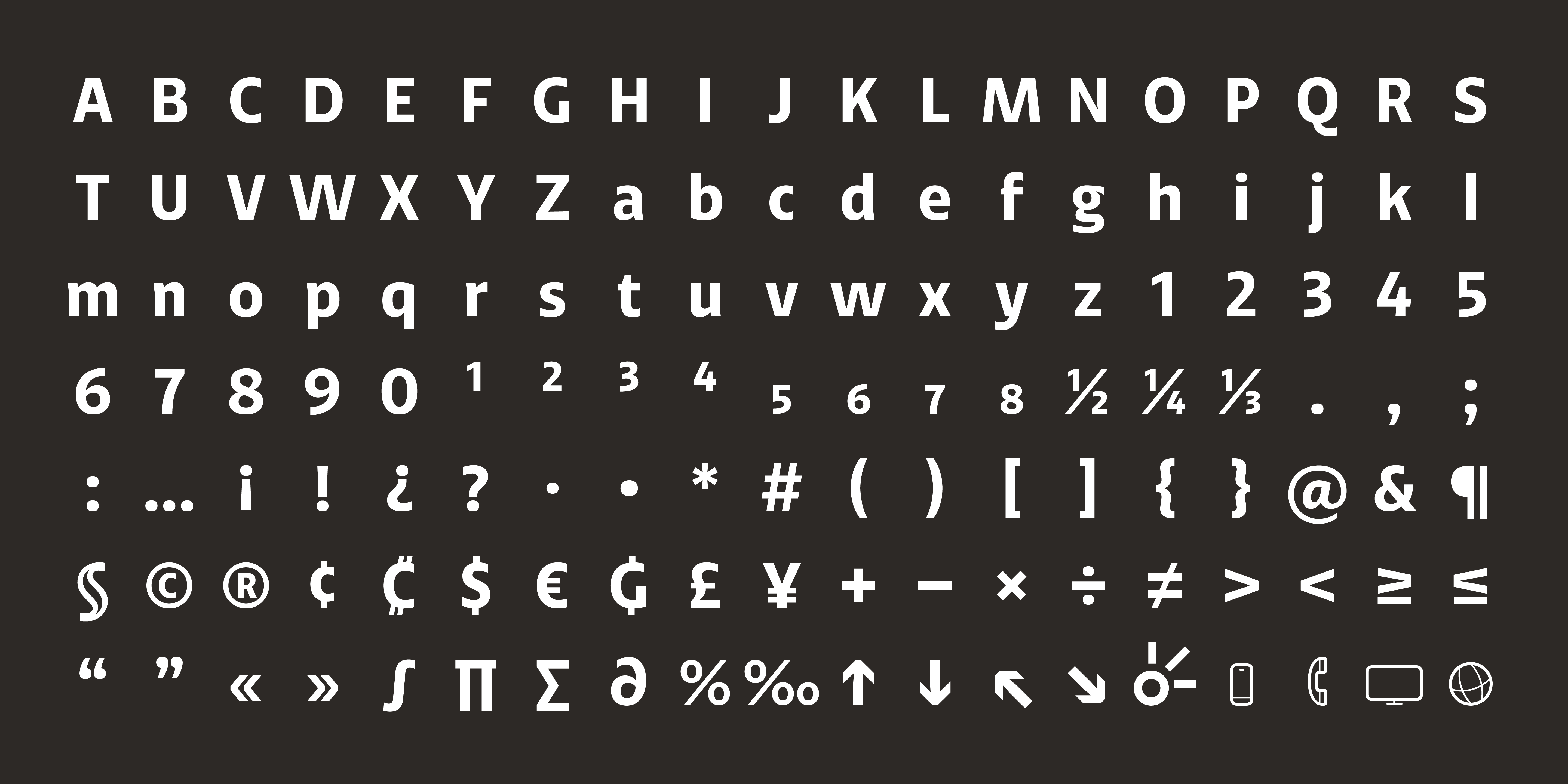
The request came as a way to reduce the cost of type licenses previously used with the DIN family. One of the main problems was the poor implementation in most Latin American countries, whose suppliers used different versions of DIN, sometimes incomplete, sometimes with different features. The client was sure that a customized and exclusive typeface would help them solve their homologation problems in their visual identity system, as well as save on licensing costs. So, under the direction of Santa Marca, we began to analyze what this system should look like, how many variables and what technical and formal characteristics would be necessary to solve its correct implementation in the design teams. The conceptual guidelines were three: it had to be human and warm (unlike DIN); it had to be versatile, that is, it had to be adaptable to the Claro logo and coexist well with Roboto, its secondary typography; and finally, it had to convey solidity and firmness, since Claro is a leading brand in telecommunications. Since its ecosystem would be mostly in digital platforms, we developed manual hinting with the support of Elí Castellanos for better performance in different browsers and digital devices. The result is a system composed of 6 weight variables in their Roman style plus their respective italics for all their communications. A variant called Claro Brands to compose the logos of the different business lines such as Claro Video, Claro Play, Claro Music, etc., as well as the incorporation of some icons and useful elements, and finally a condensed variant with the same 6 Roman weights to be used in formats such as invoices that require horizontal space saving. In total, 19 fonts make up the system, managed according to the type of users the company has. The result has benefited the company, which has decided to call the typeface AMX instead of simply Claro, as this will allow it to be implemented in new América Móvil brands.
Client: Santa Marca for América Móvil Art direction: Ernesto Romero and Eric Silva Type design: Antonio Mejía Lechuga