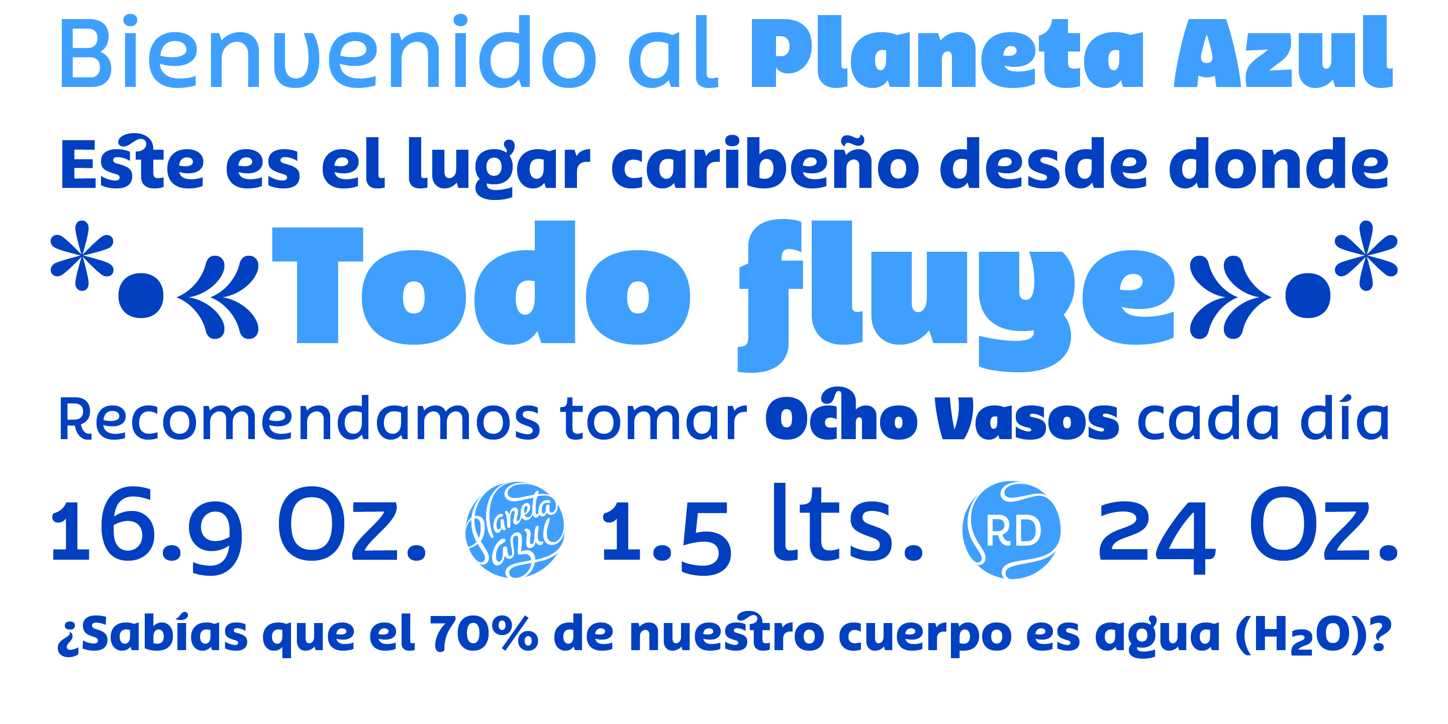
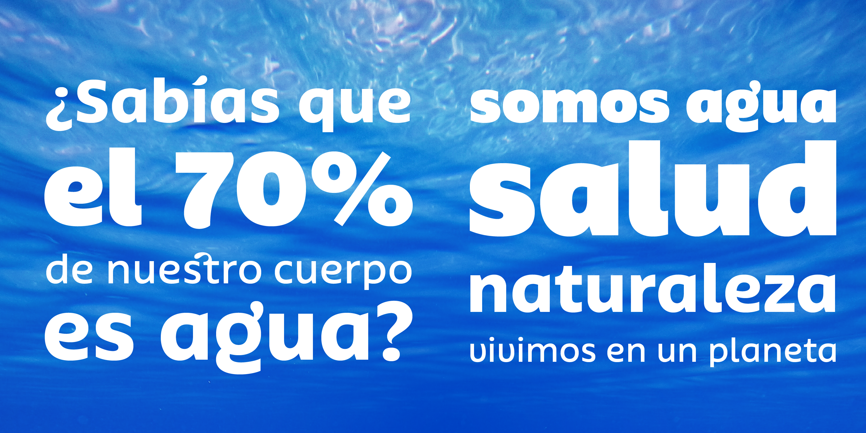
The Dominican brand Planeta Azul, which has become the absolute national leader in the healthy beverage market with an international presence, has a new voice.
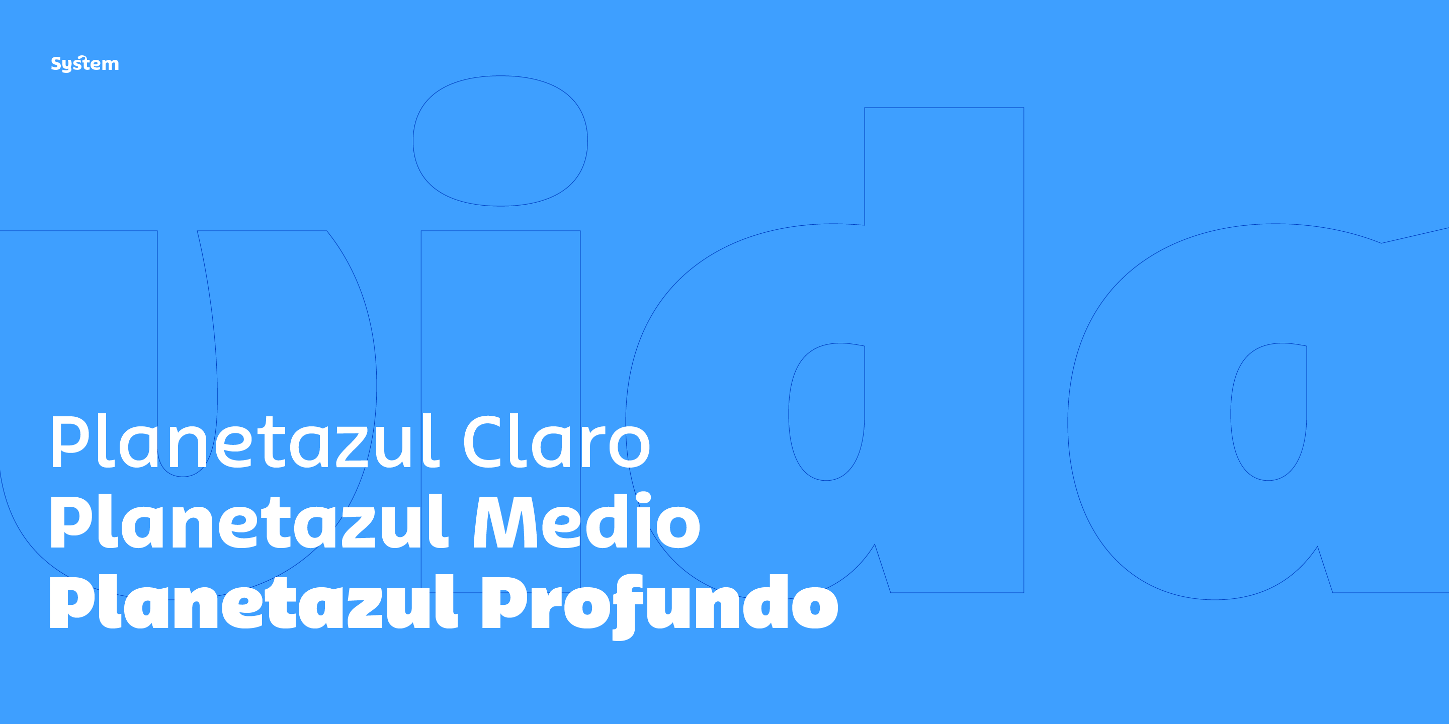
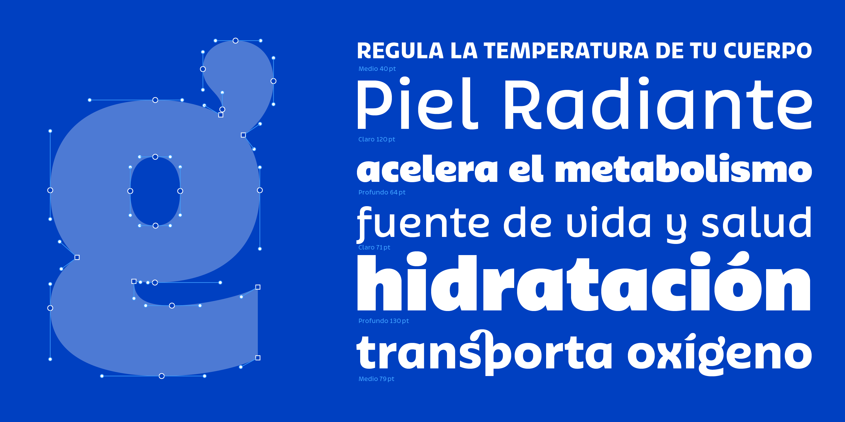
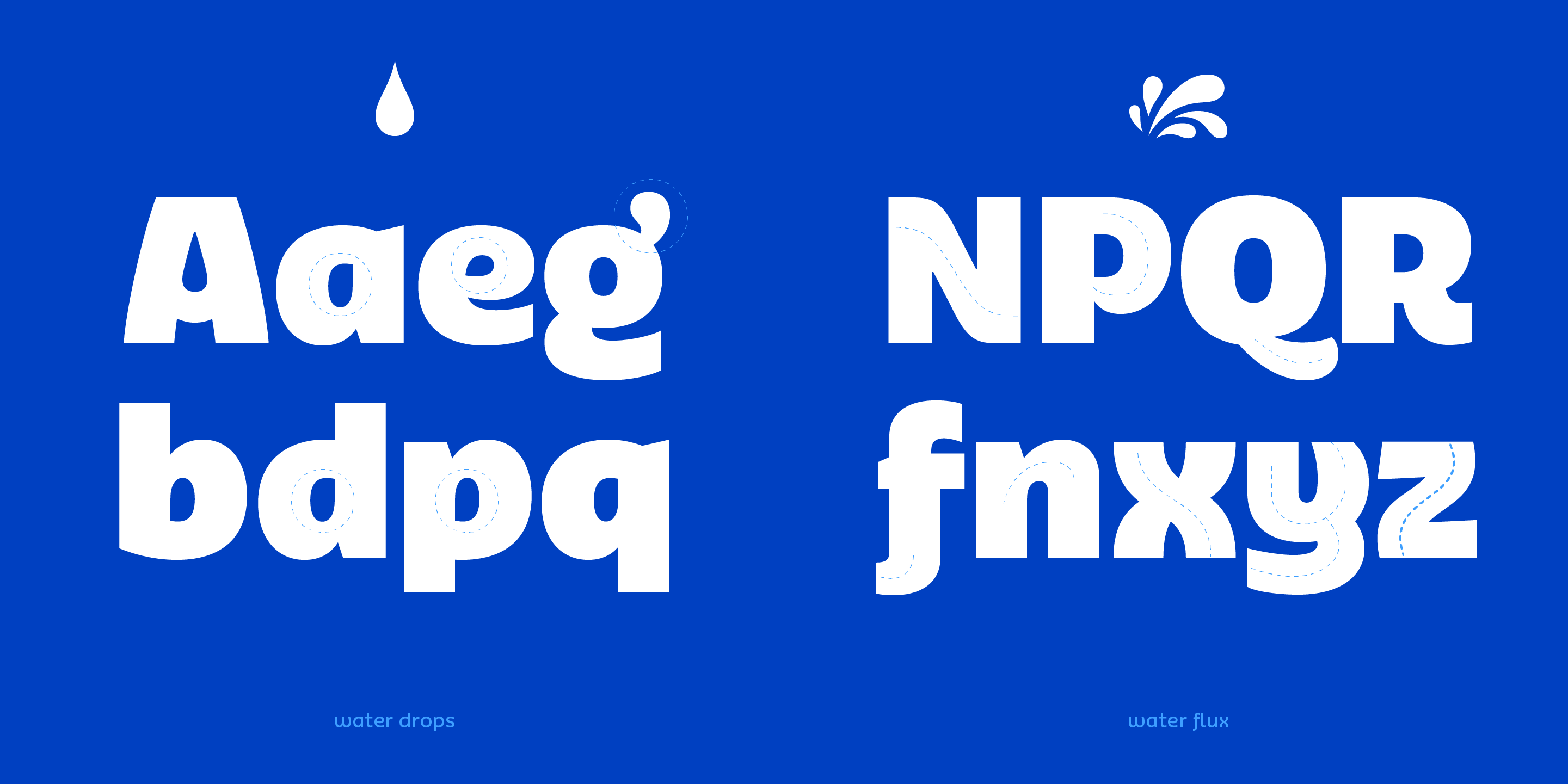
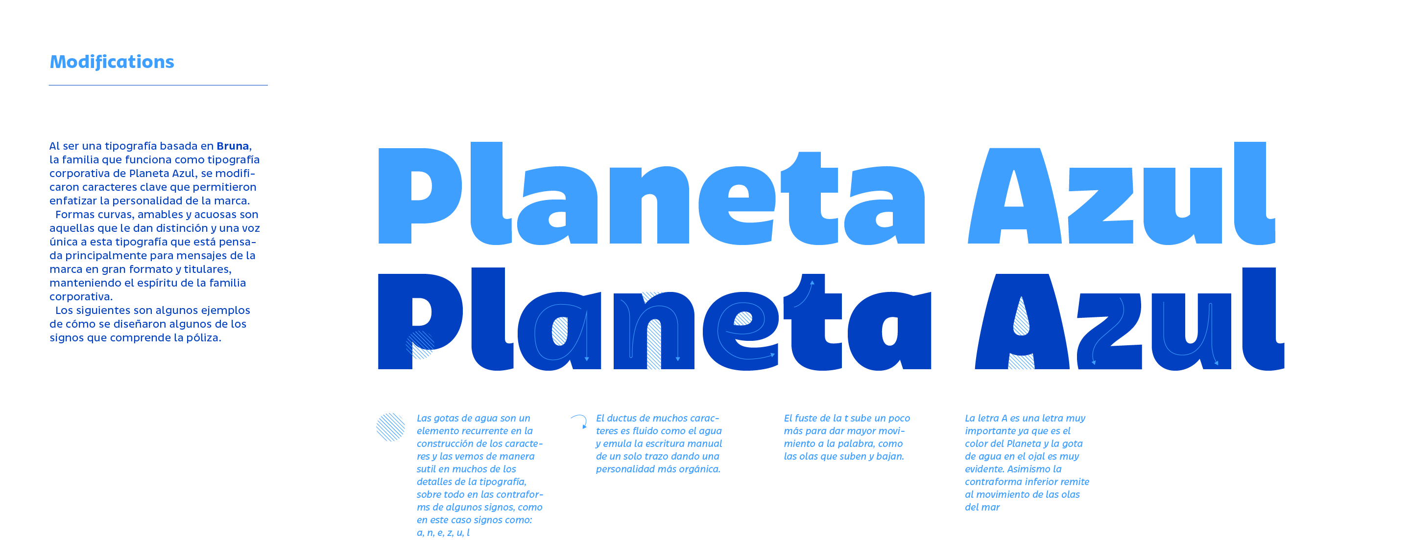
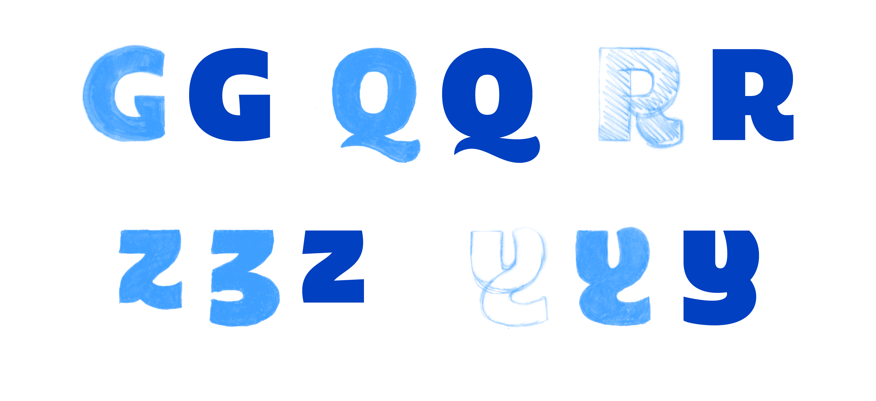
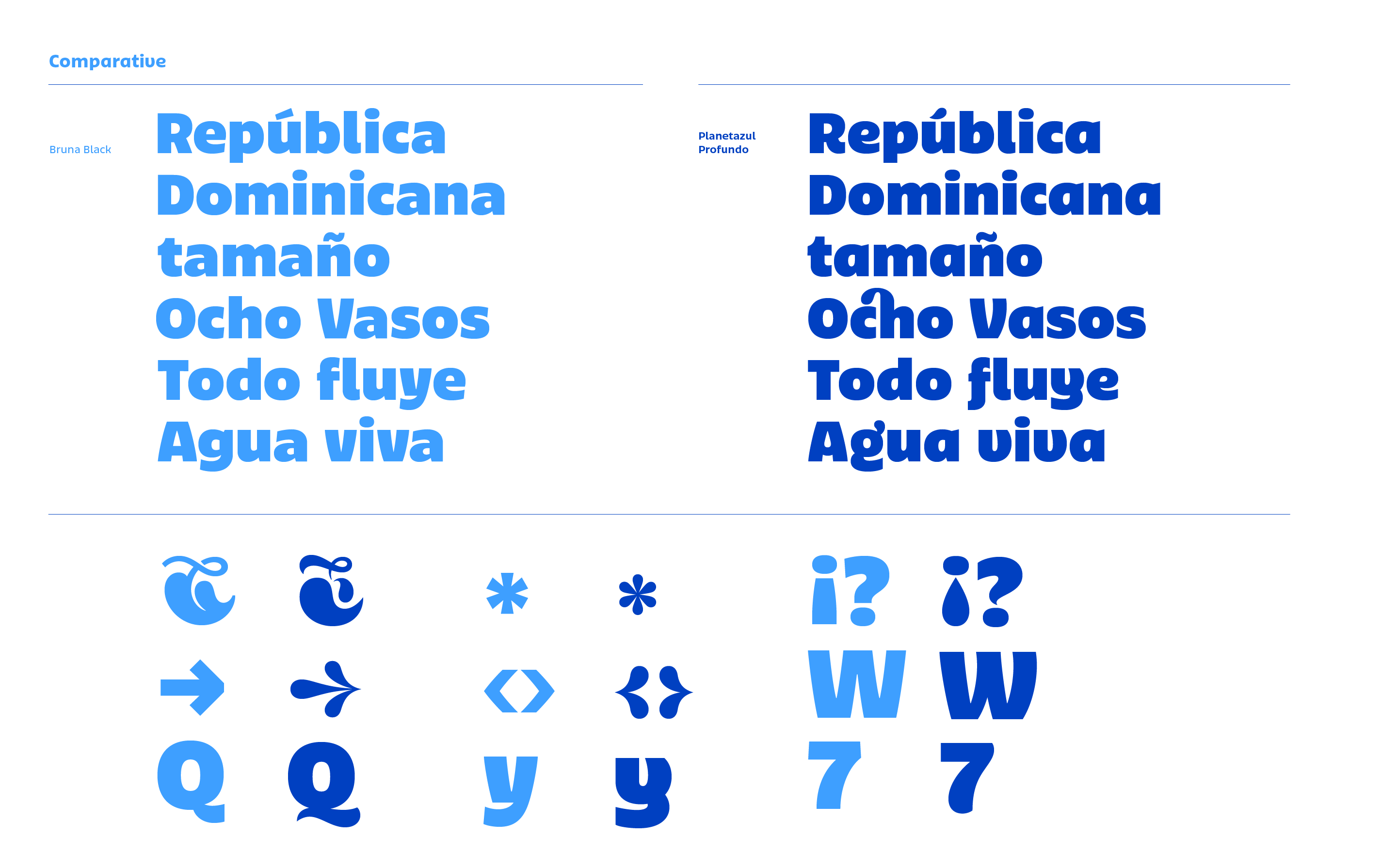
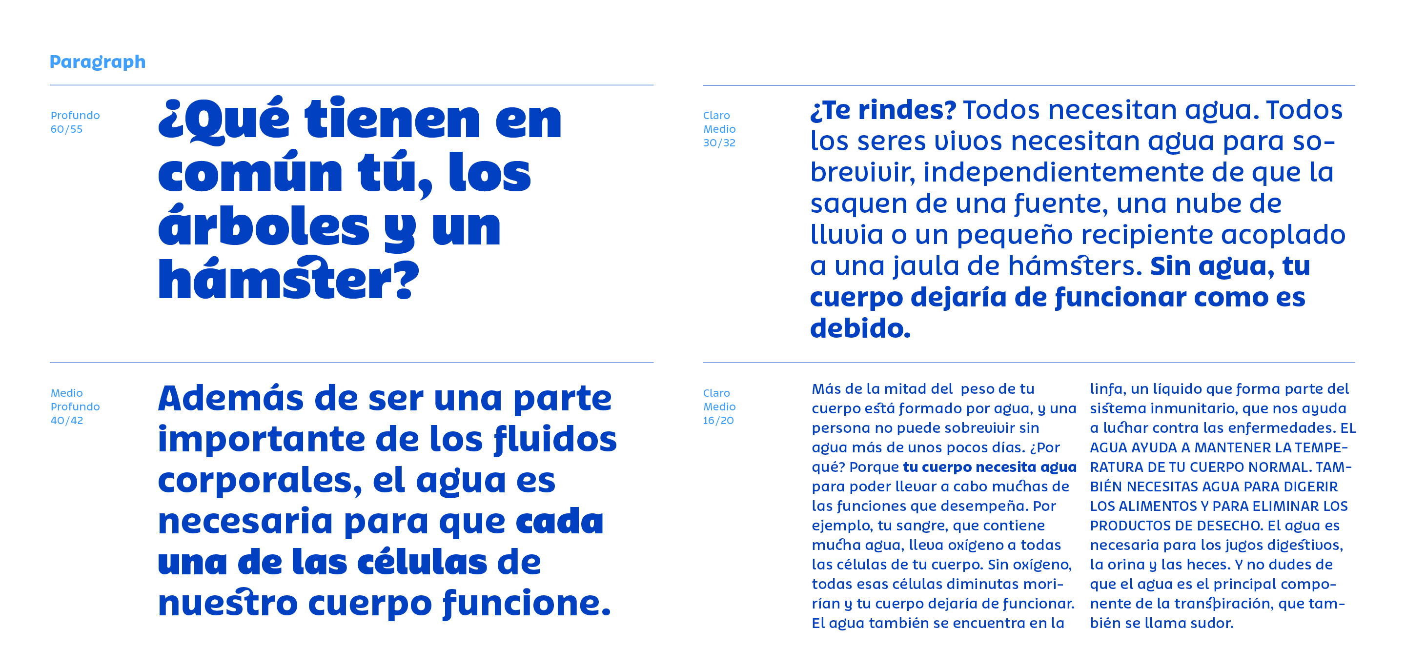
I had the luckiness to design, for the Dominican brand Planeta Azul, the customization of its corporate typography thanks to the invitation of Juan Carlos Fernández, in charge of the redesign of the brand. In the beginning, the project only consisted of executing the concepts designed by Juan Carlos, who selected my typeface, Bruna, as the brand voice; throughout the creative process, he suggested to the client to develop an exclusive typeface tailored to highlight the main messages of the brand. The result was called Planetazul, and it comes in three weights, Profundo, Medio, and Claro, from darker to medium. The purpose of the typography was to transform Bruna in water, so we adapted the strokes, endings, and details to speak such language.
Client:Agua Planeta Azul Branding, creative direction:Juan Carlos Fernández (juan carlos.world) Type design, production:Antonio Mejía Lechuga