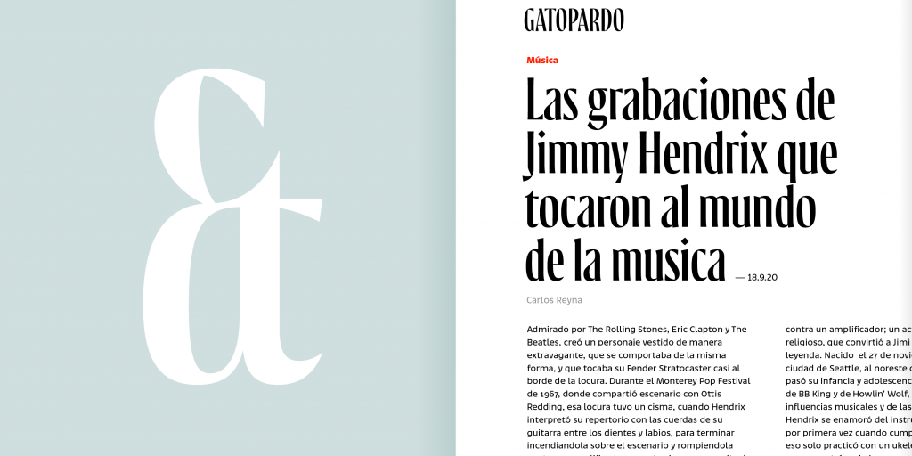
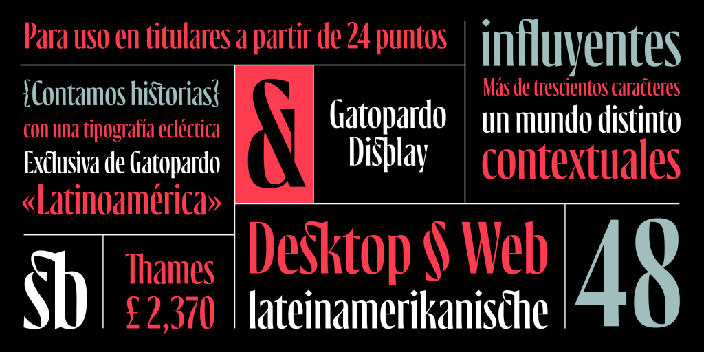
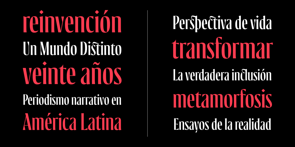
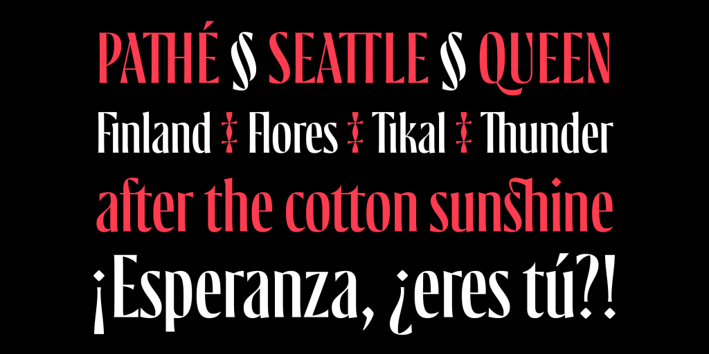
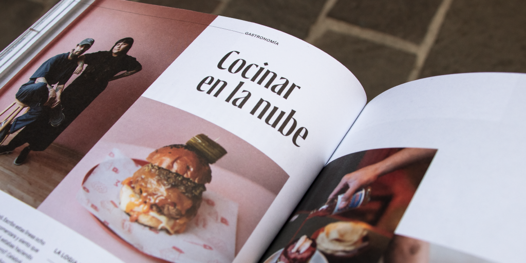
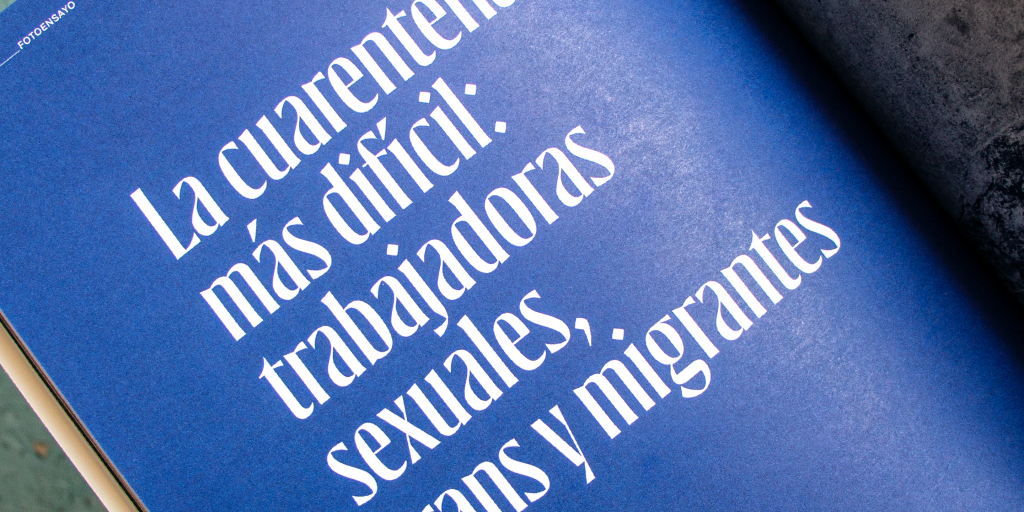
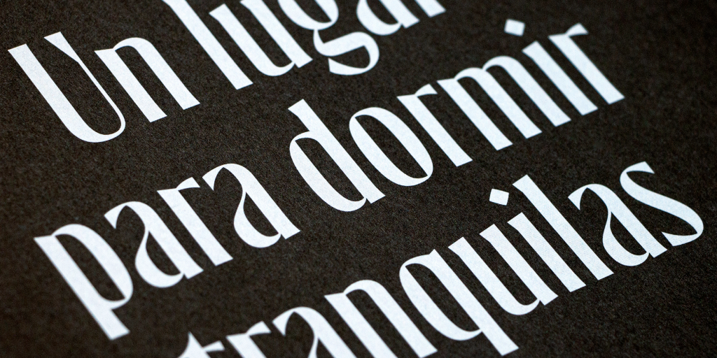
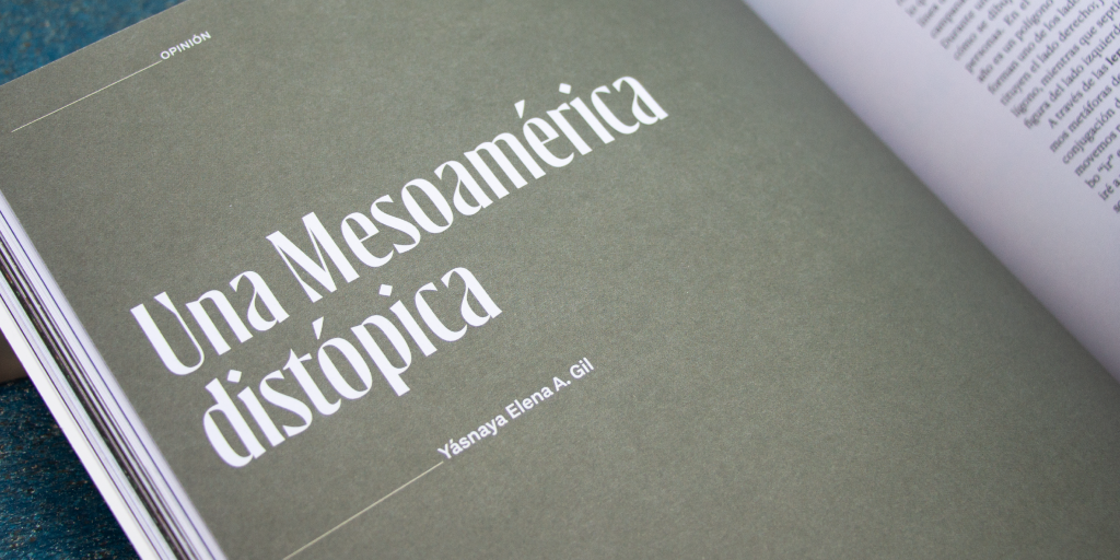
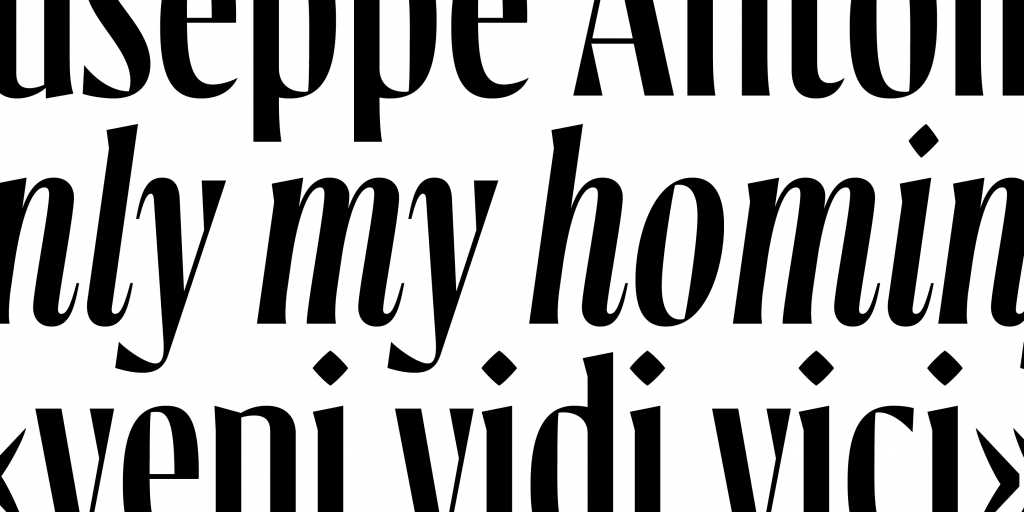
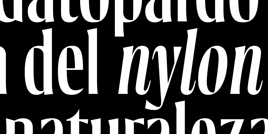
Gatopardo Display is the new custom font for the magazine of the same name, the perfect pretext for celebrating its 20th anniversary.
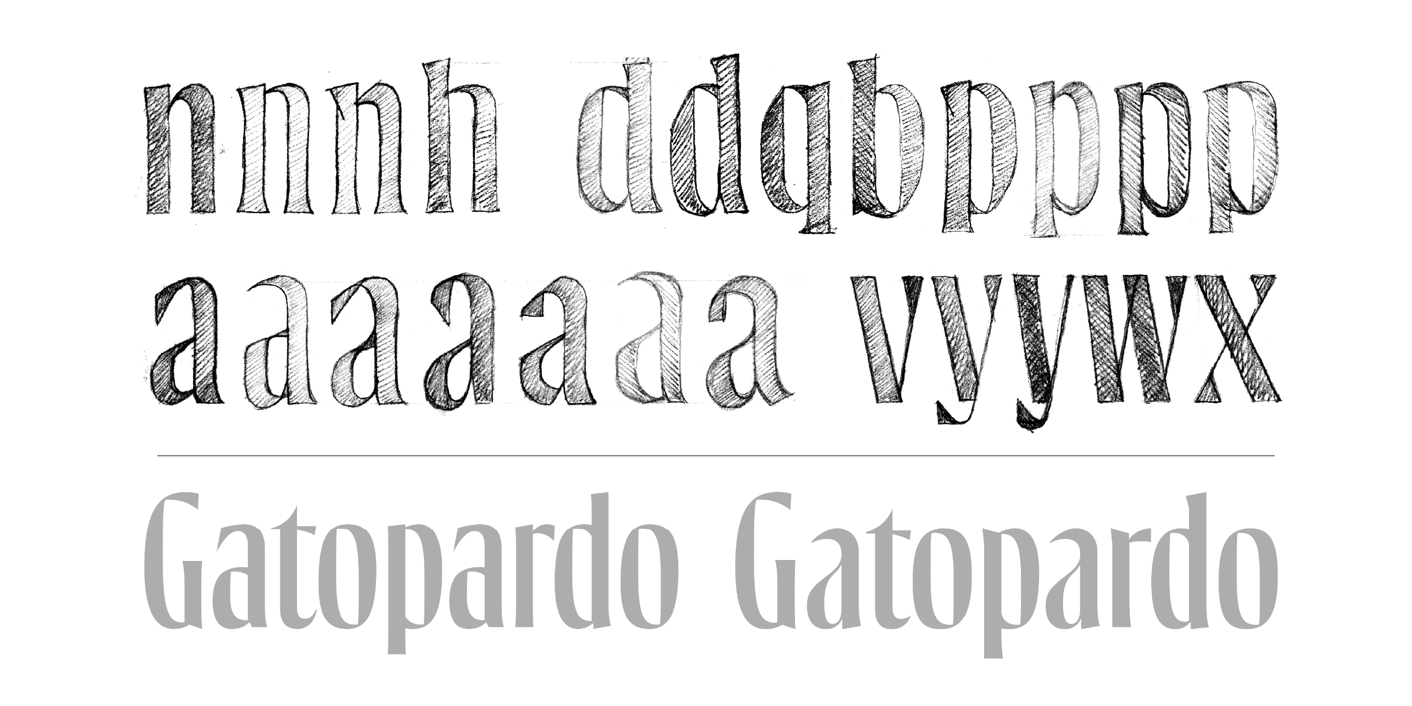
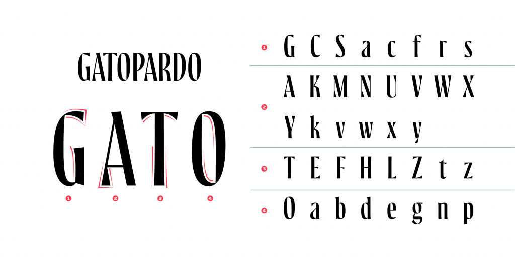
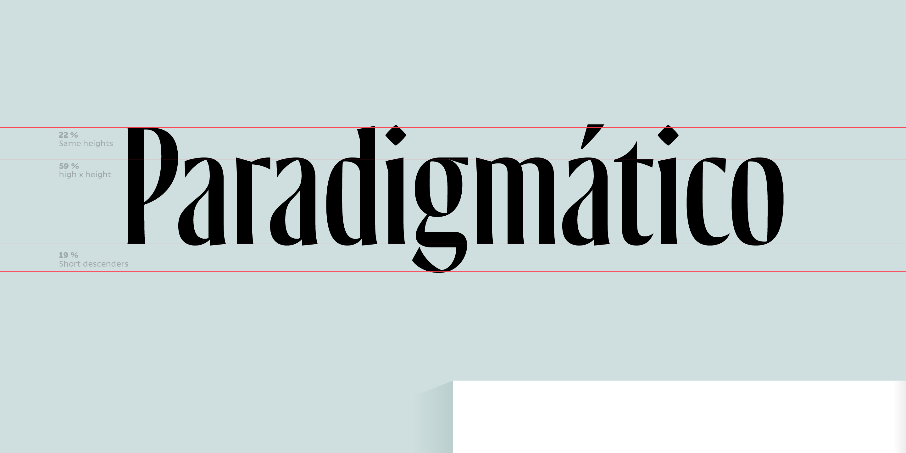
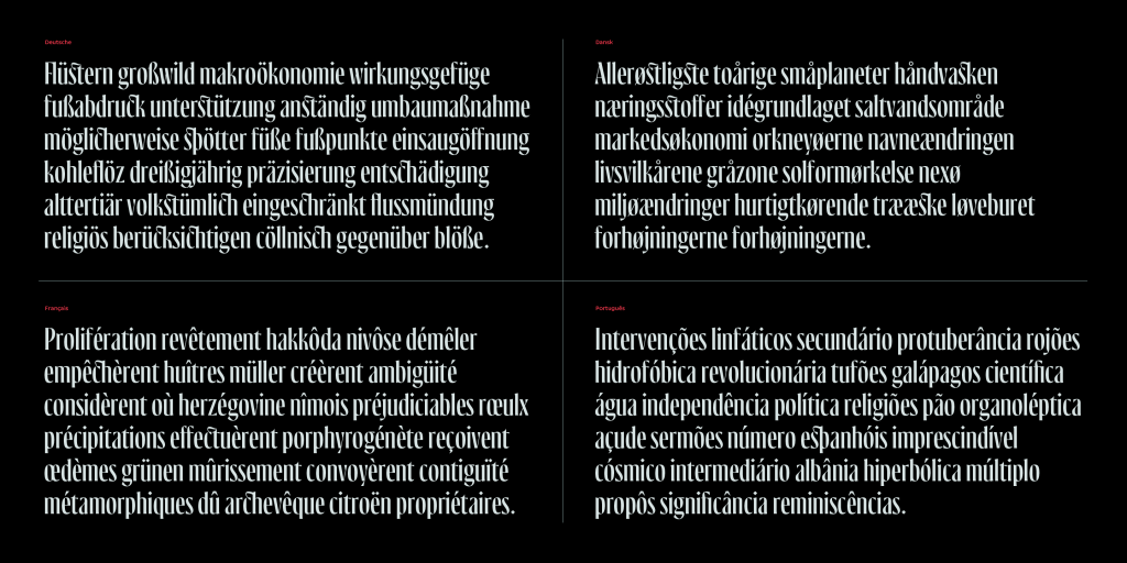
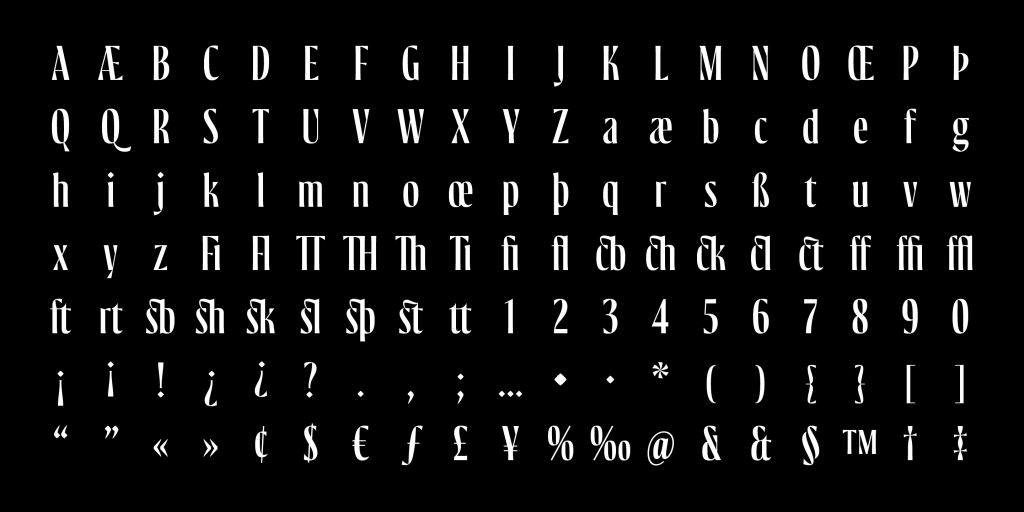
A renowned Mexican magazine of Latin American narrative journalism commemorated its twentieth anniversary. The design firm, varela+kimura, in charge of the editorial and brand redesign, invited me to participate in this project, designing a custom font based on their new logo. Because it was a display typeface, it was required to have a short vertical space, so the heights of the uppercase and ascending letters had the same size. To extract the DNA from the font, I relied on the internal counters of the letter O, the serifs of G, A, and the slight expansion details on the axes. All these components led to their reinterpretation for the rest of the characters. The result of Gatopardo Display was very satisfactory and very well-received since the font reinforces the identity of a magazine that remains fresh after twenty years and fits perfectly with its graphic and narrative style.
Client: Revista Gatopardo Logo, editorial designers and creative direction: David Kimura and Gabriela Varela Type design and production: Antonio Mejía Lechuga