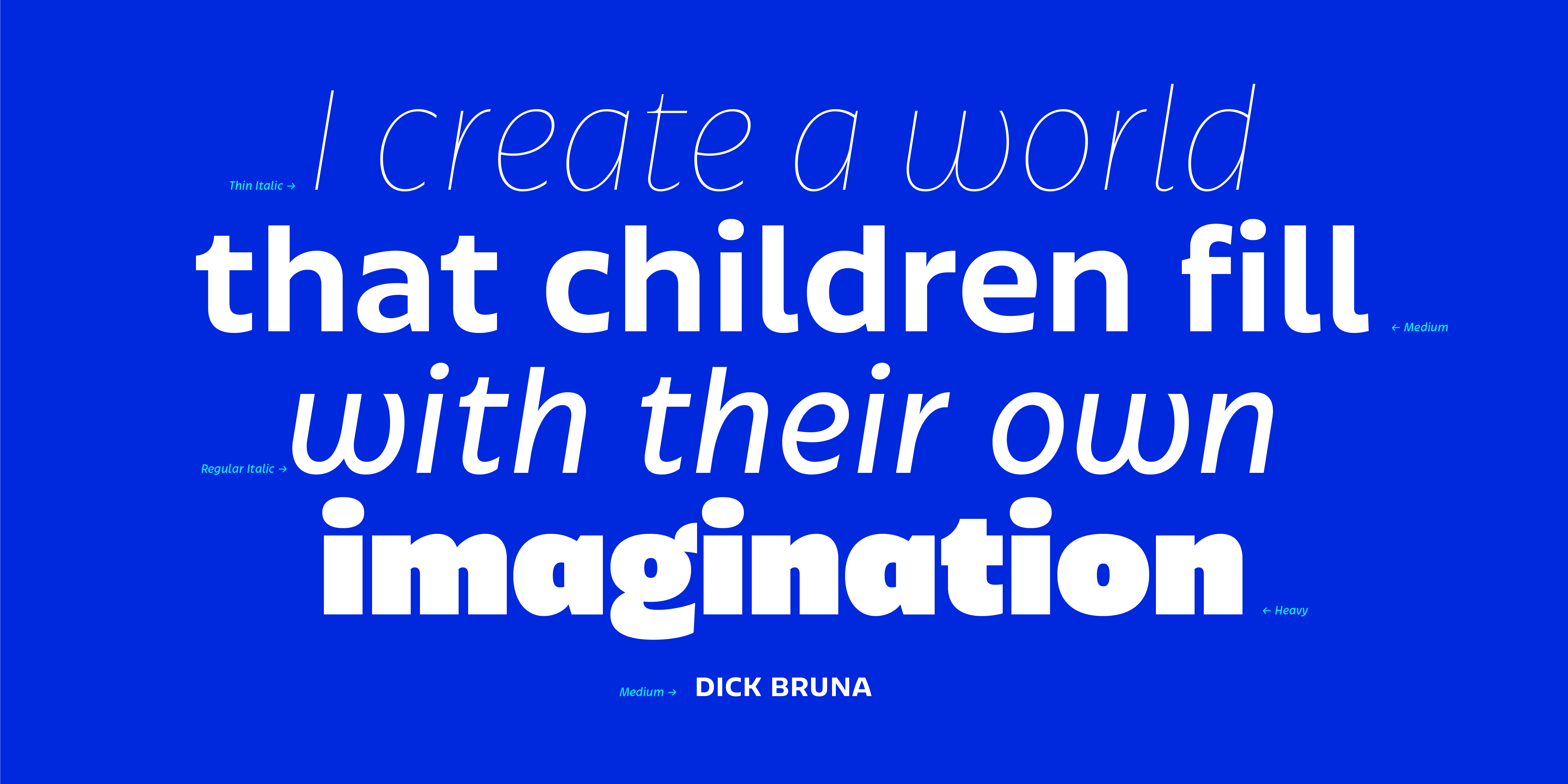
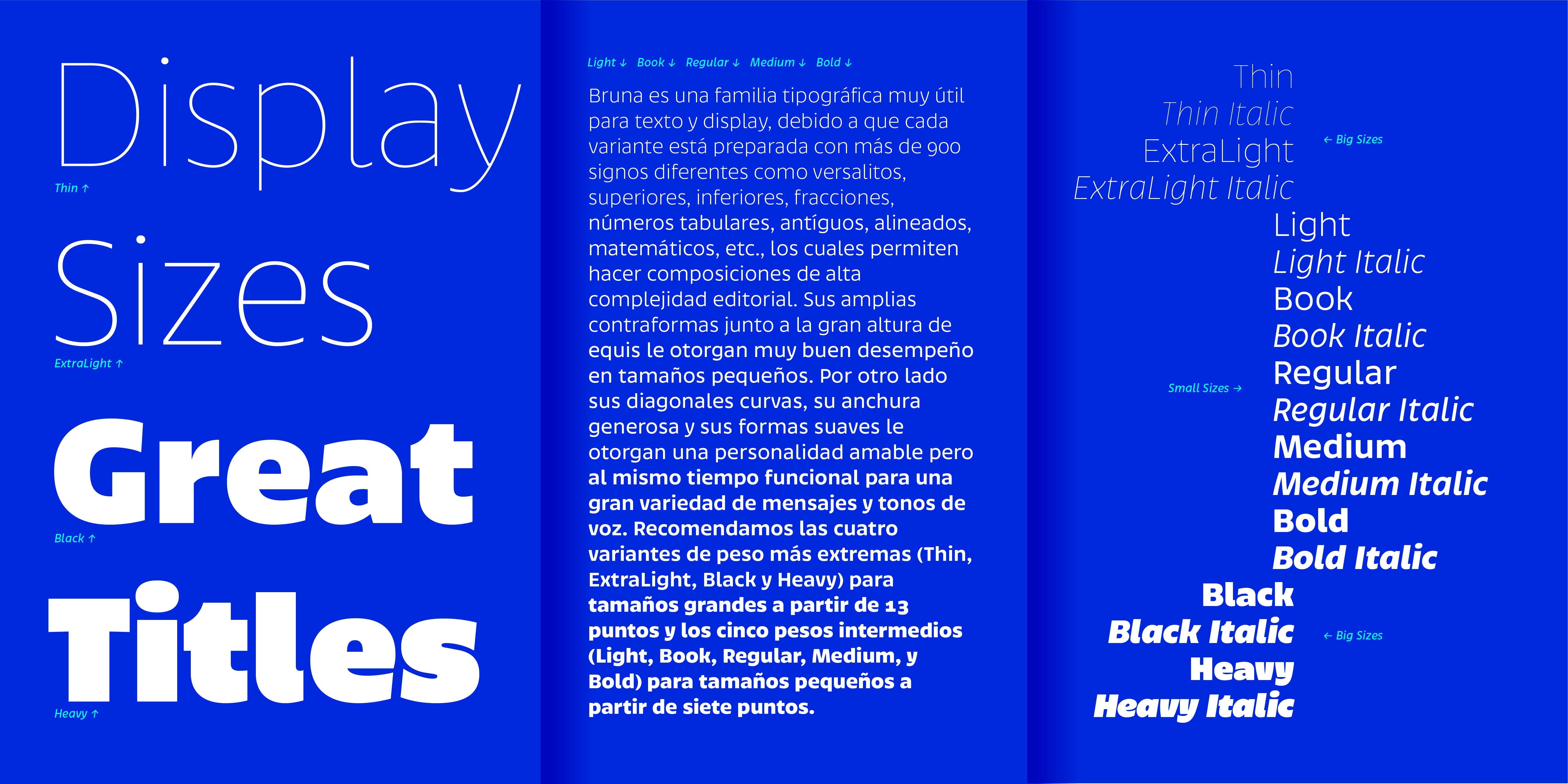
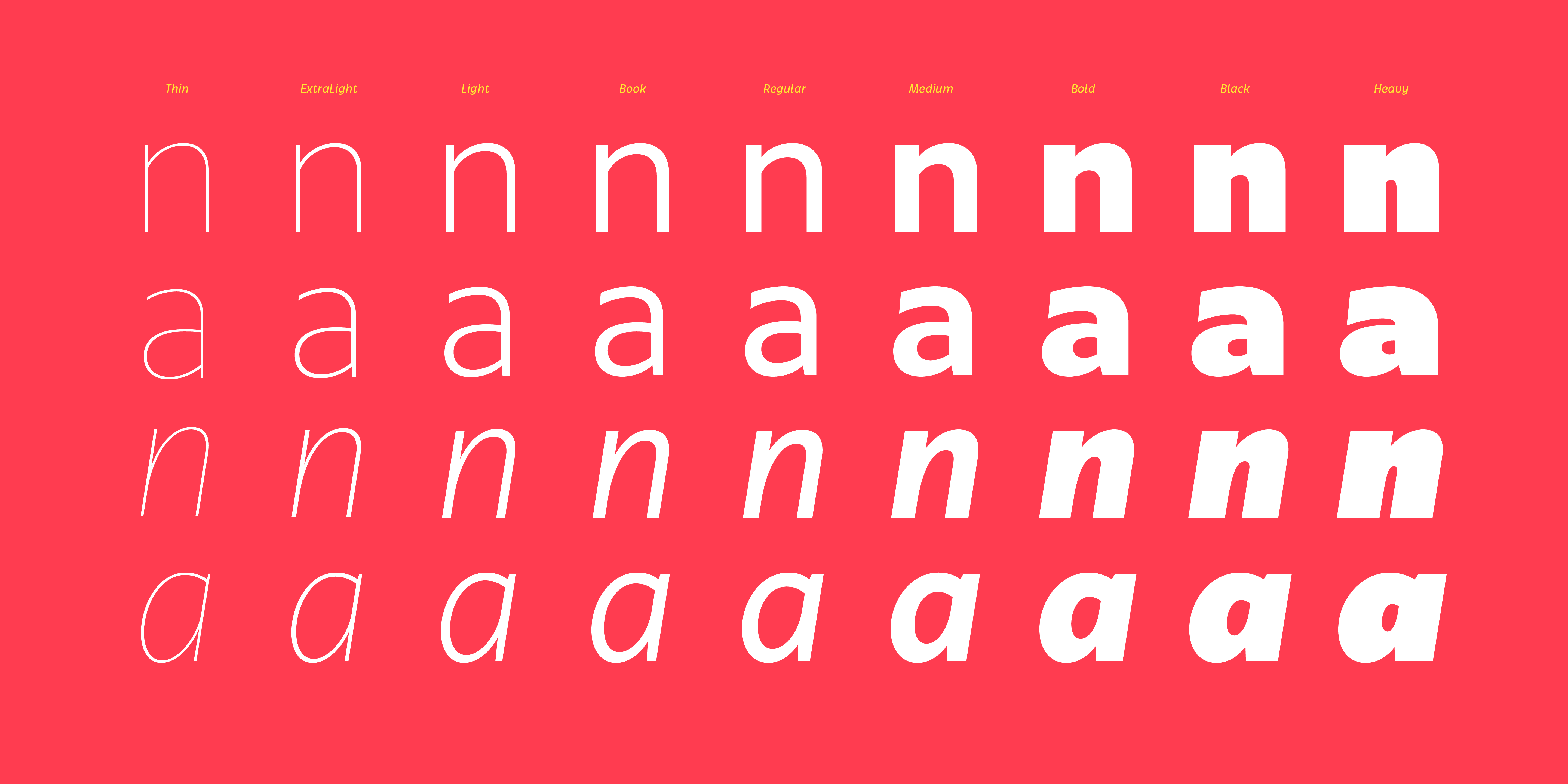
In the beginning, we developed a friendly display font, and later we worked the intermediate weights to work in small sizes and give a clear hierarchy in texts. In short, we wanted to build a functional family without becoming too large.
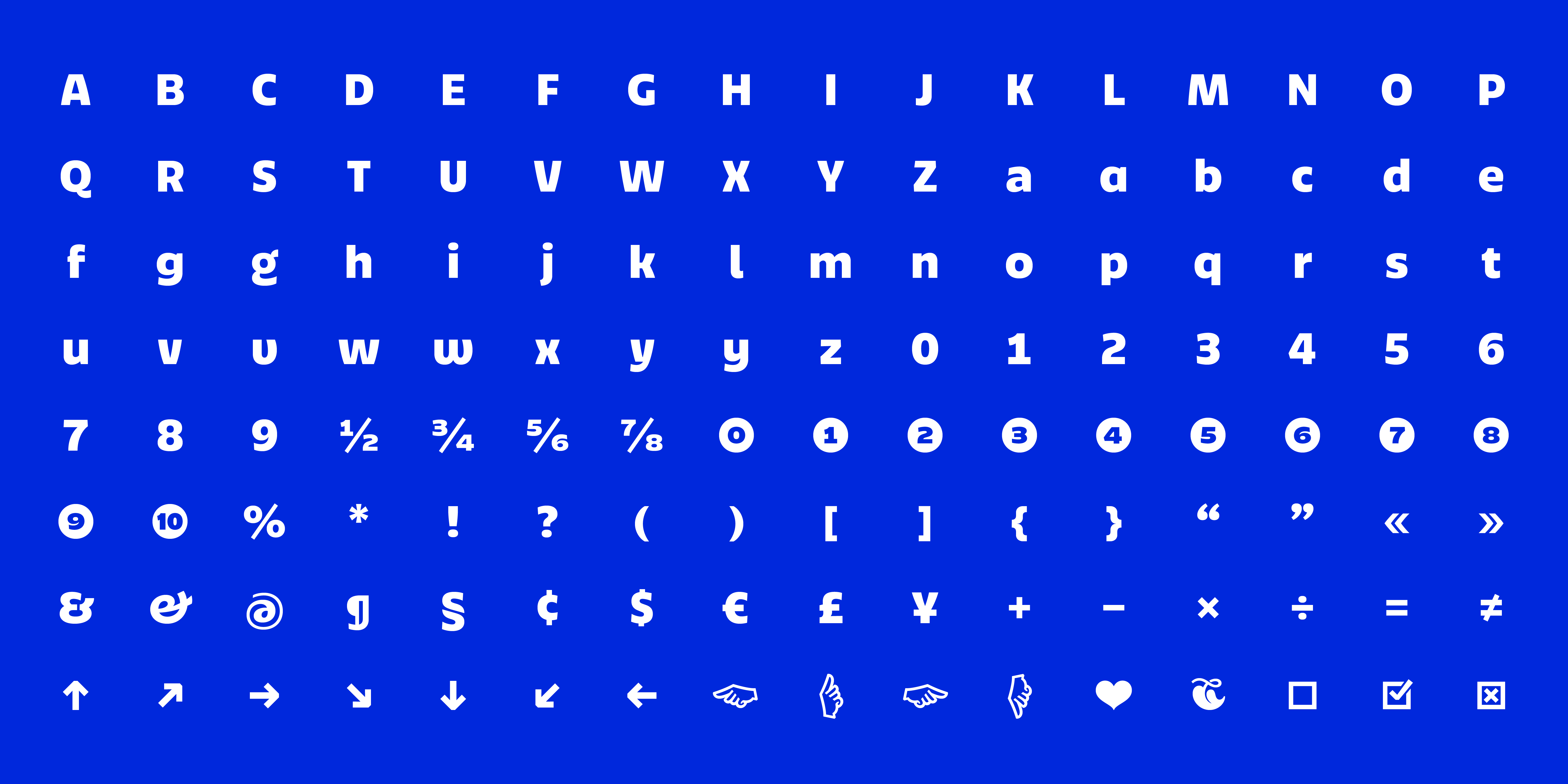
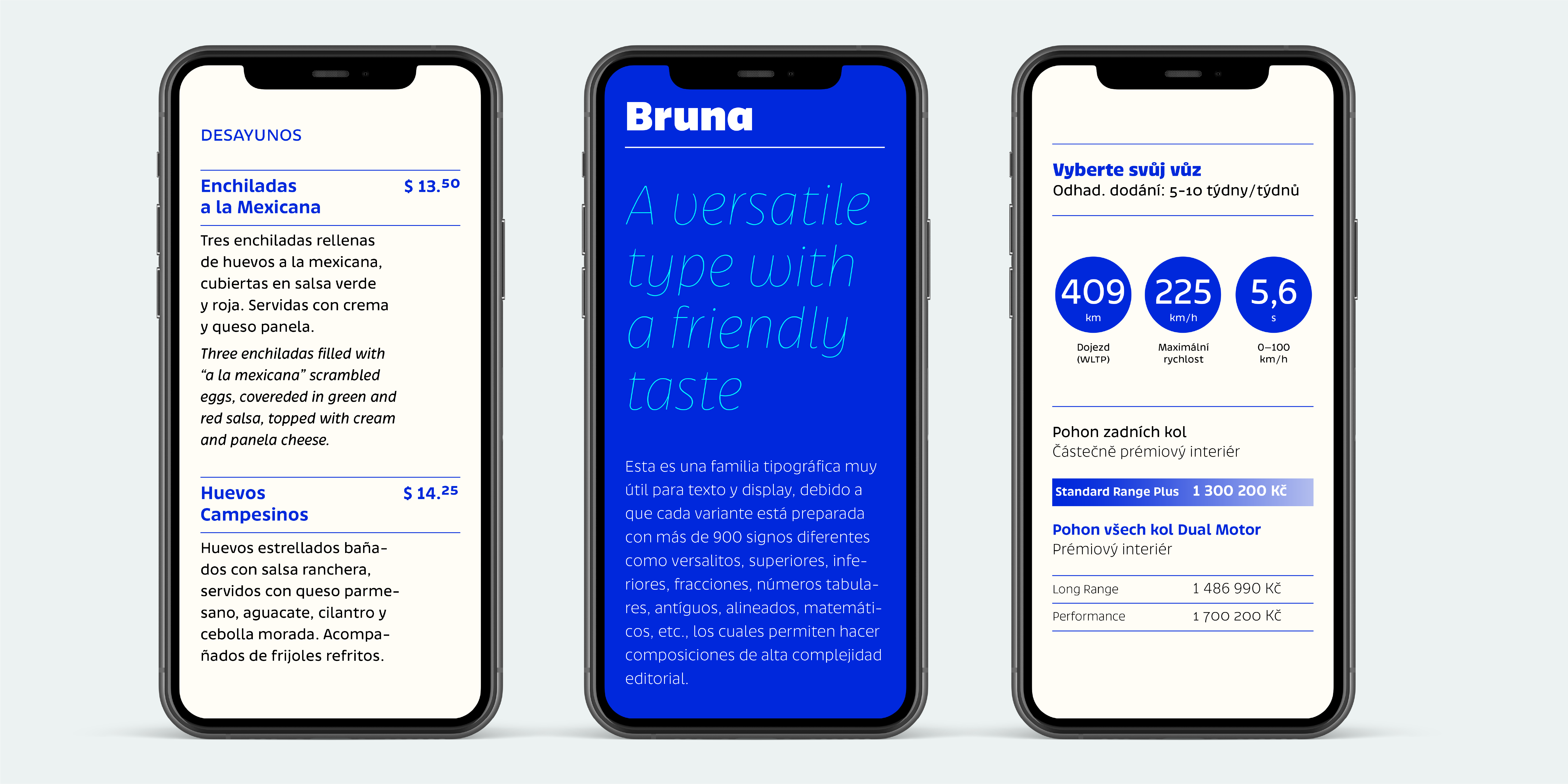
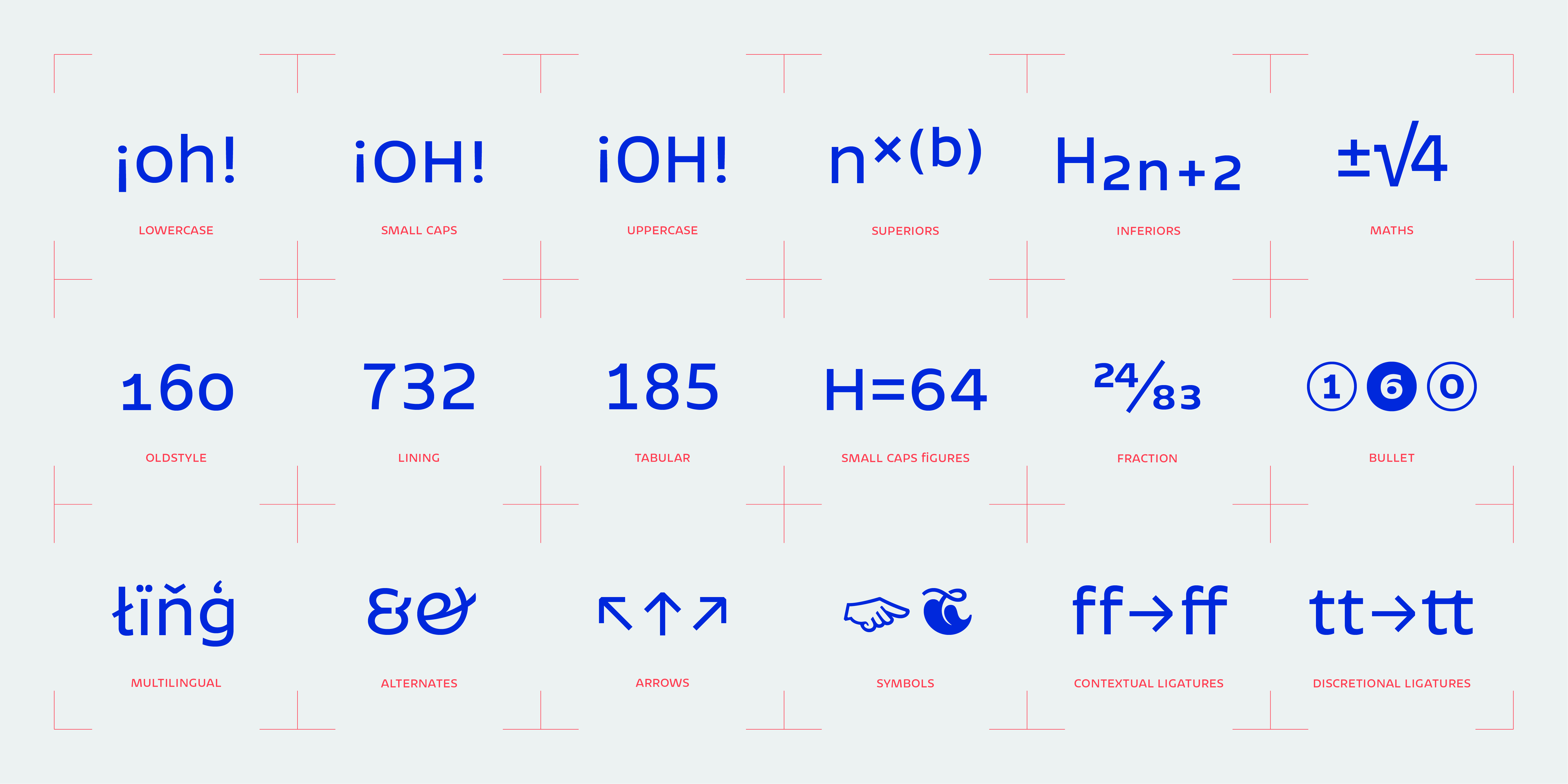
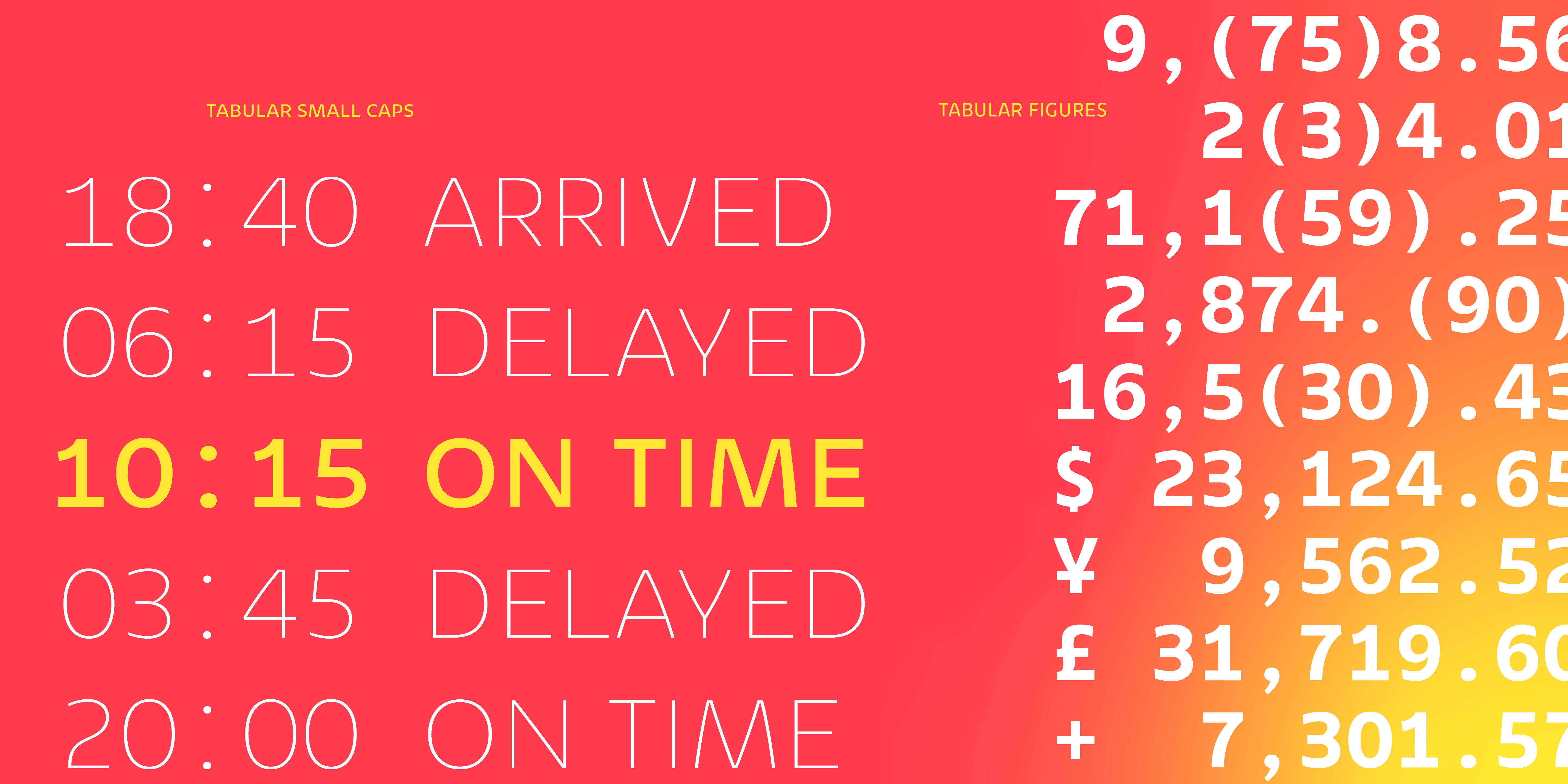
Bruna is an ideal typeface family for text and display. A versatile family with a pleasant taste. We developed a 18 font family with almost 900 different glyphs such as small caps, superiors, inferiors, fractions, tabular, old-style and lining figures, mathematical, numbers, etc. Allows you to compose editorial complexity. Its open counters and great height of x give it excellent performance in small sizes. On the other hand, its curved diagonals, generous width, and soft shapes give it a friendly but functional personality for a wide range of messages and tones of voice. We recommend the four most extreme weight variants (Thin, ExtraLight, Black, and Heavy) for large sizes starting at 18 points and the four intermediate weights (Light, Book, Regular, Medium, and Bold) for small sizes starting at 7 points.