Thanks to Mestiza being available on Adobe Fonts, a user could access its variants. After an initial email exchange, they showed interest in having us adapt the typeface for use by a nonprofit organization.
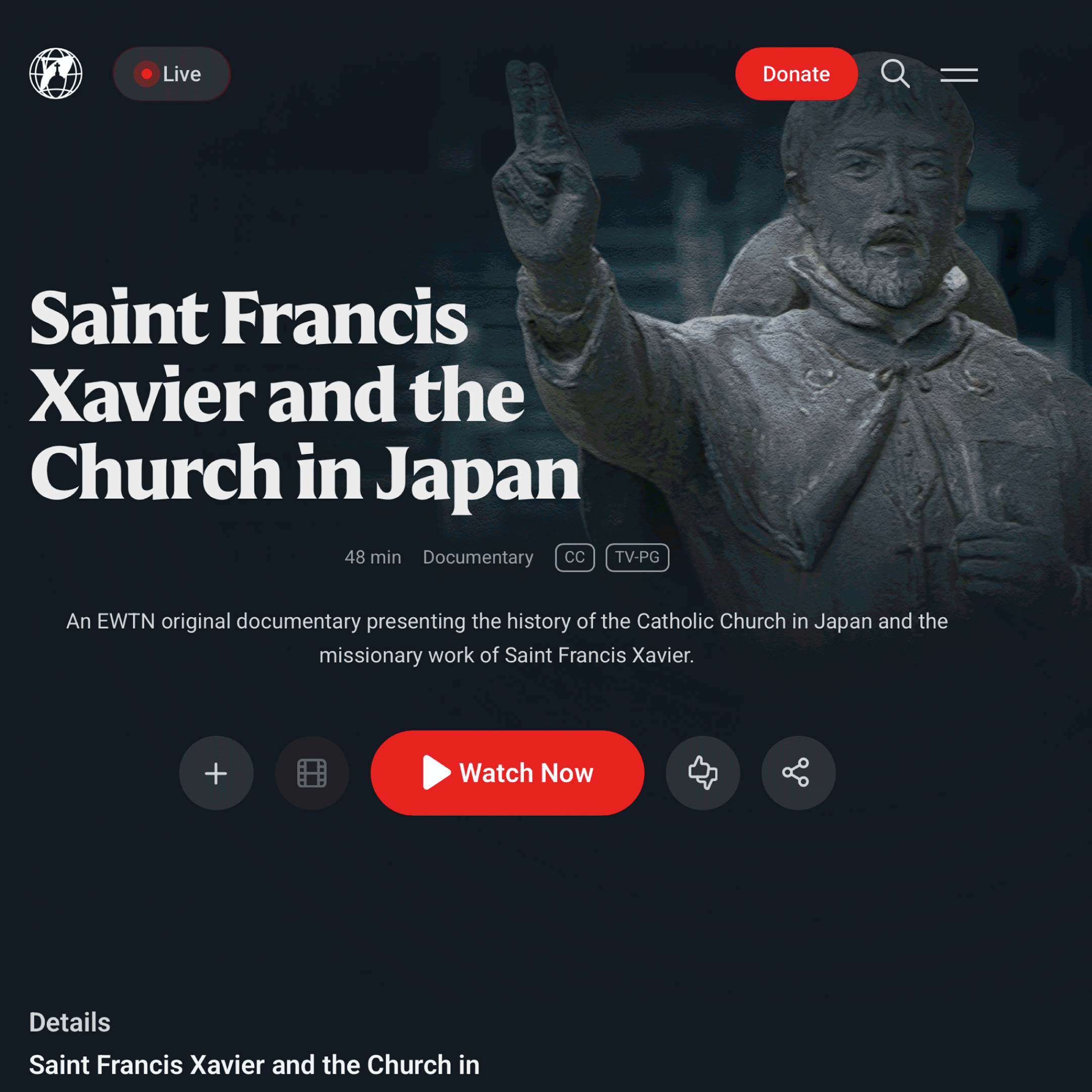
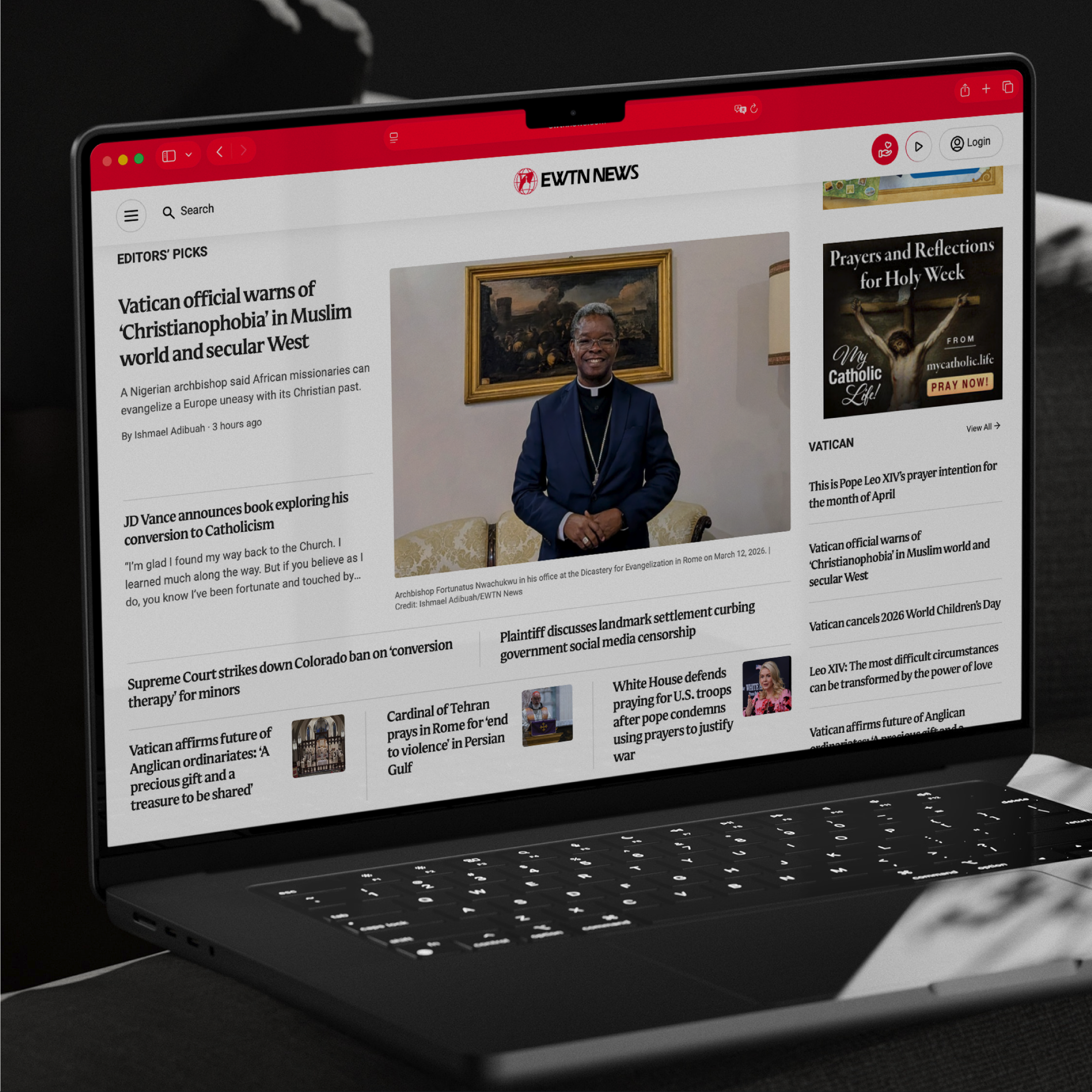
This initiated a collaboration that resulted in a strong, enriching working relationship, during which we set out to develop a custom typeface for the media network, Eternal Word Television Network. This project demonstrates how an existing typeface can evolve into a unique typographic voice aligned with an organization’s identity.
Client: Eternal Word Television Network Art direction: Sam Zamarron Type design: Antonio Mejía Lechuga
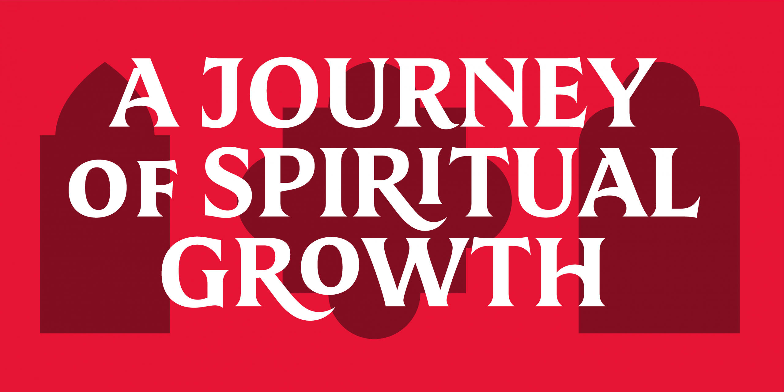
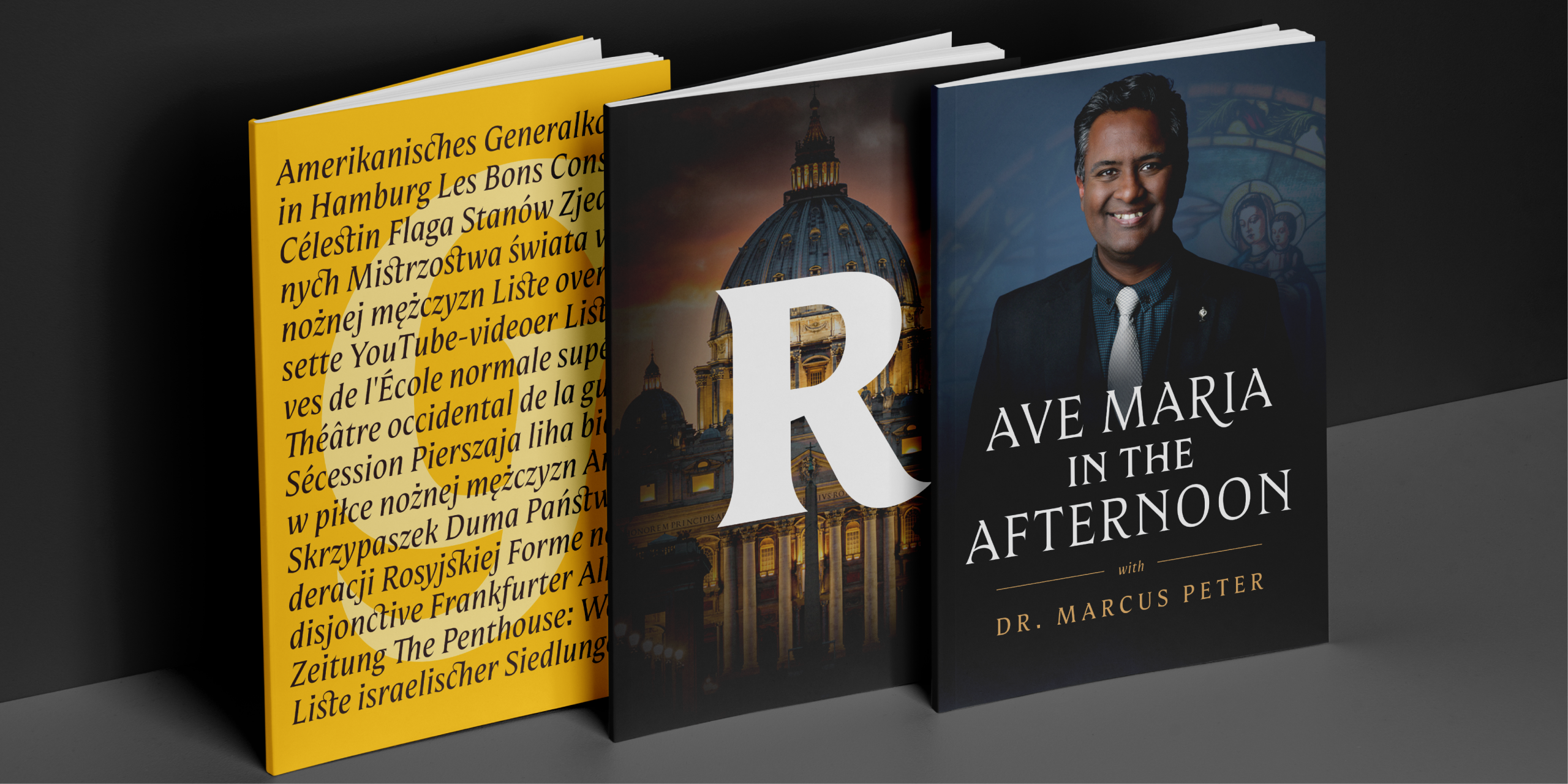
The goal was to create an exclusive typeface based on Mestiza for use across all its platforms as a corporate typeface. It was designed as a multiplatform typeface family, primarily focused on digital environments—such as websites, broadcast media, apps, and e-pubs—as well as images for social media and print. Its main purpose would be for headlines, titles, subtitles, and short phrases starting at 14 pt, with special emphasis on the distinctive features of the uppercase letters. This approach ensures not only visual consistency but also a unique presence at every interaction with its audience.
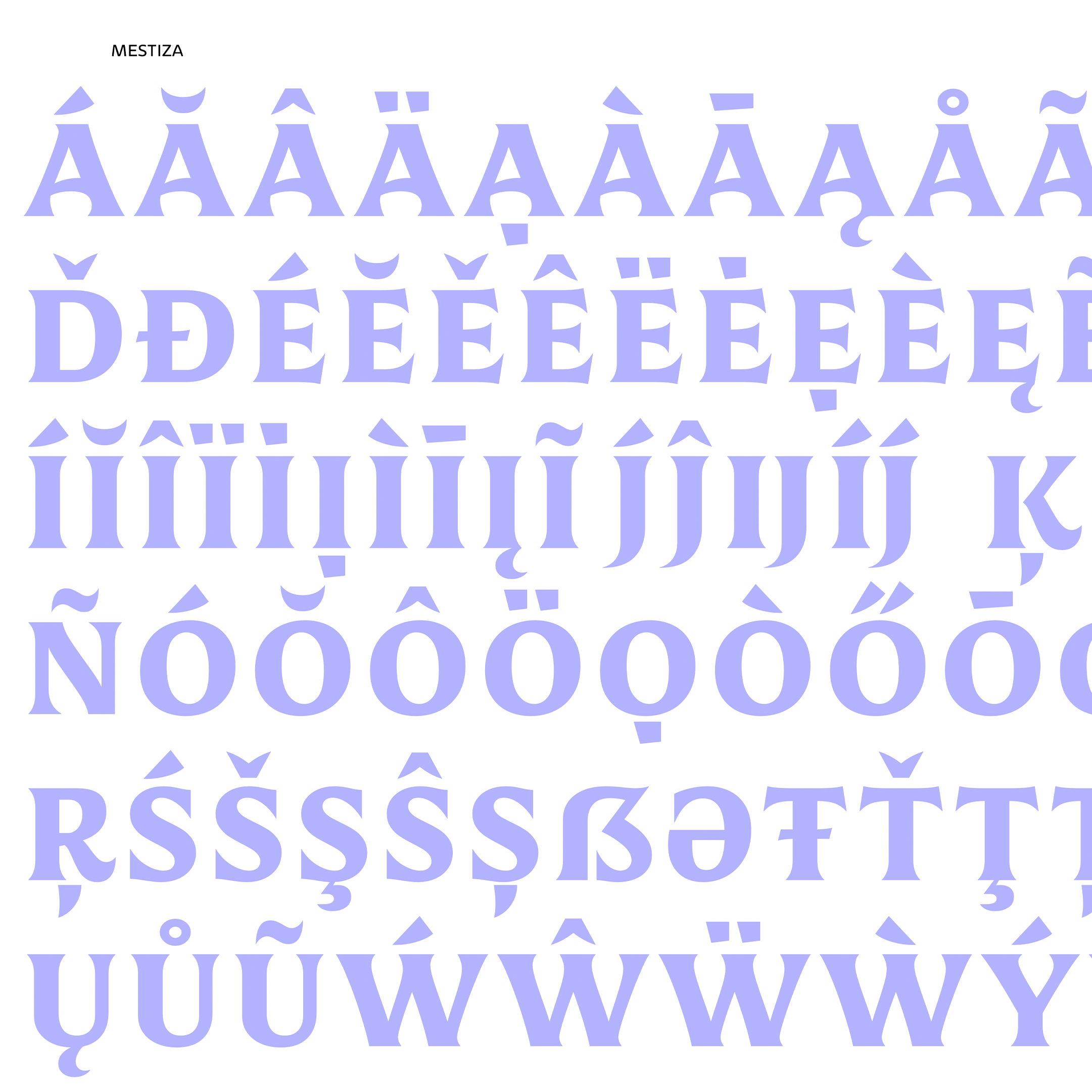
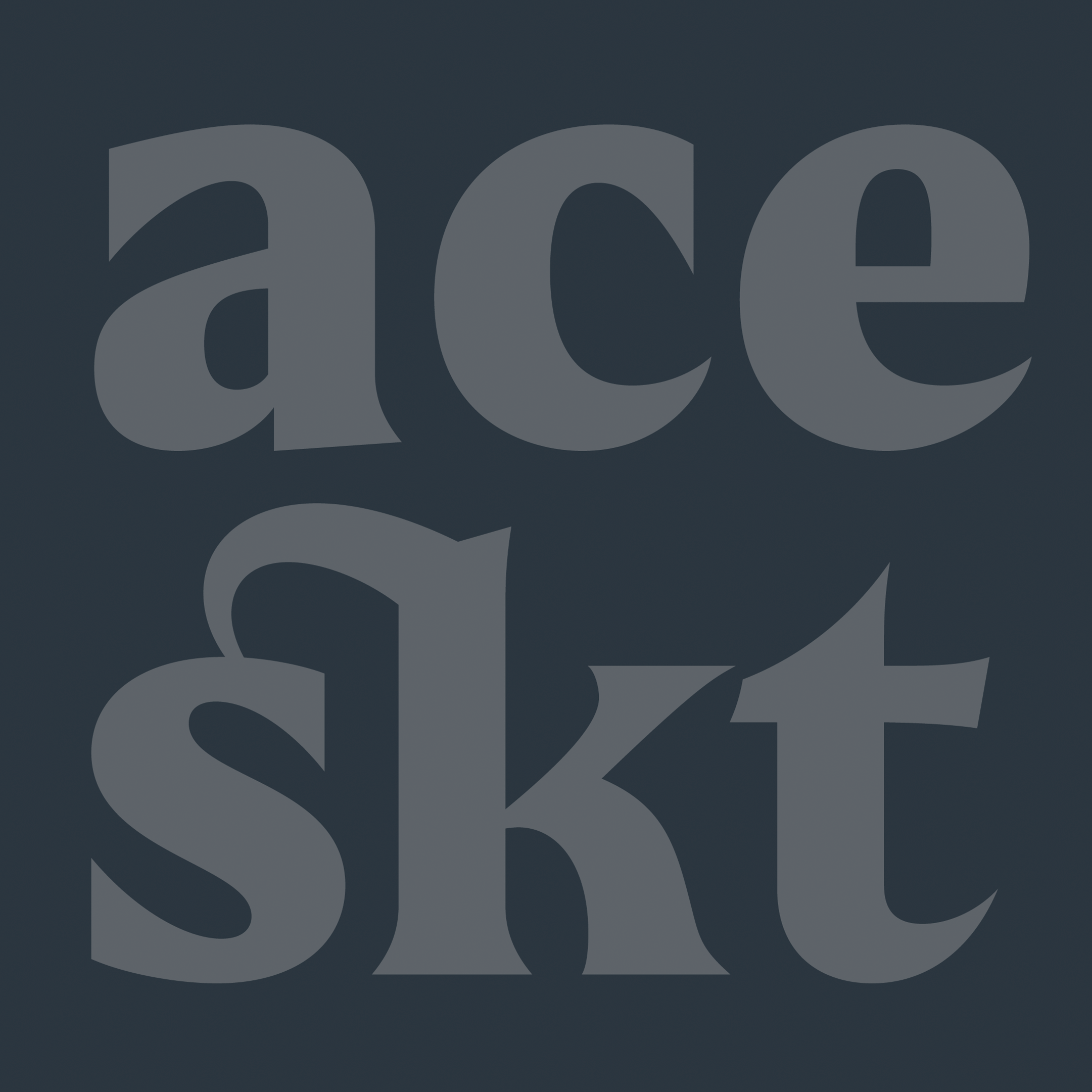
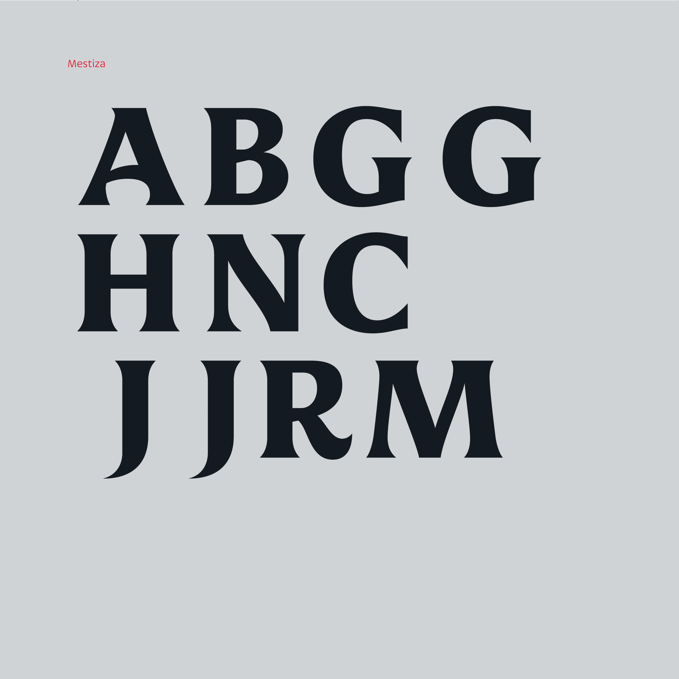
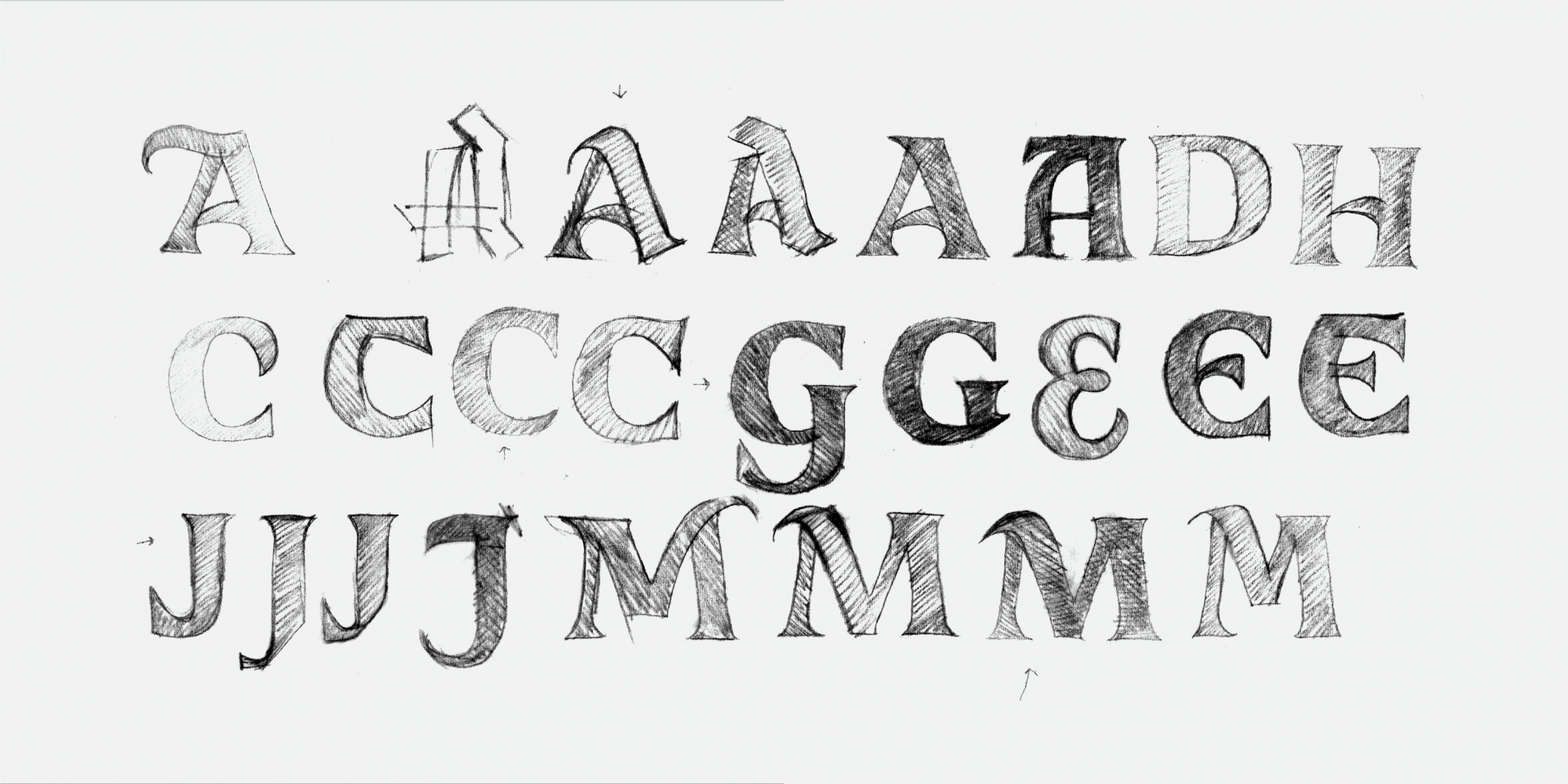
The first step involved adjusting the waistlines of uppercase letters, giving them a strong, distinctive character and a greater sense of authority. Since the typeface would be named Guadalupe, we began by modifying key letters, such as the /G/, along with others of symbolic significance—such as the /J/ for Jesus and the /M/ and /A/ for Mother Angelica. These changes were gradually applied to the rest of the characters, establishing a coherent system that clearly sets Guadalupe apart from its original base, Mestiza.